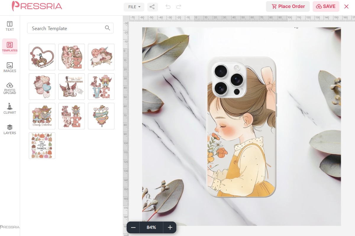
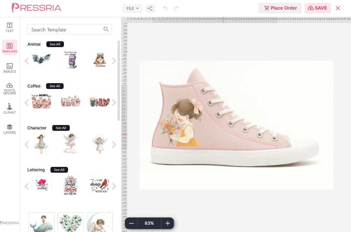
Setting up personalized products on Shopify and WooCommerce — from installing the app to downloading print-ready PDFs. One manual, both channels: setup differs, and a handful of later items are tagged for one channel or the other.
Shopify onlyWooCommerce only
Every UI label is set in mono, so what you read here is what you look for on screen. Most of the manual applies to both channels; anything that does not carries one of the tags above.
01Overview
What the product does and the two words a merchant has to understand before anything else.
1.1How Pressria works
A customer personalizes a product in the Pressria editor, and Pressria produces a print-ready PDF you download and send to your printer. Your store keeps handling the catalogue, checkout and payment; Pressria handles only the design step and the print file.
The editor only appears on products you have set up in the Pressria admin. Everything else in your catalogue behaves exactly as before — setting a product up is what switches the editor on for it, and no other product's behaviour changes.
Where the editor appears differs by channel, and it is the only difference a customer ever sees:
Channel
When the customer designs
Shopify
After checkout. The editor runs as Shopify's post-purchase page, so the customer pays first and personalizes on the confirmation step.
WooCommerce
Before adding to cart. An Edit Design button appears on the product page next to Add to Cart, so the customer personalizes first and then buys. The finished design follows the line item into the cart, through checkout and onto the order — and its thumbnail shows up in the cart, at checkout, on order pages, in order emails and on the WordPress admin order screen.
The order matters for how you write your product descriptions. On WooCommerce a customer can see their design before paying; on Shopify they cannot, so say up front that personalization comes after checkout.
1.2What a design is
A design is the unit Pressria bills on. One design is one completed personalization — the point at which a customer finishes editing and the print file for that item is produced. Browsing, opening the editor, and abandoning halfway all cost nothing.
On the Free plan your first 20 designs each billing cycle are free. Paid plans have no free allowance — they trade it for a lower rate, so every design is charged from the first one. Each charged design costs a percentage of that line item's price, with a per-design minimum and maximum. The rate depends on your plan.
Three consequences worth knowing before your first invoice:
Quantity counts once as a design, but the charge follows the line total. One design is recorded no matter how many copies are printed. The fee, however, is a percentage of what that line item was paid — unit price × quantity — and never more than $5.00 for a single design. A $10 product bought once costs 5% of $10; bought a thousand times it reaches the $5.00 ceiling rather than scaling without limit.
A cancelled or fully refunded line item is still charged the per-design minimum. The print file was already produced, so the floor applies — but the percentage is waived.
Rates are never applied retroactively. Each design keeps the rate it was created under, so changing plans does not re-price what you already have (8.2).
1.3Product types
Pressria handles two fundamentally different kinds of product, and the difference runs through the whole manual.
Printed products. T-shirts, phone cases, mugs — an object that already exists, with artwork printed into a fixed area on it. You supply a mockup photo and mark out where the printable area sits on it.
Cut products. The artwork's own outline becomes the object. There is no fixed area to print into, so instead Pressria generates a cut line around the design.
Keychain — acrylic keyrings, stands, phone grips and korotto (a mini stand cut flat at the bottom, 3.2). Adds a cut line, a ring hole and a base size.
Sticker — four kinds, told apart by where the cut line comes from and how the stickers come off the press (3.8):
Free-form die-cut — the cut follows each piece of the customer's artwork, and every sticker comes out loose (3.9).
Seals and kiss-cut sheets — the same artwork-following cut, but only through the sticker layer, so the stickers stay on a peelable sheet (3.10).
Die-cut shapes — a circle, square or rounded square is the cut line; each sticker comes out loose (3.11).
Kiss-cut shapes — the same shapes, kiss-cut onto a small backing sheet (3.12).
A product with no Keychain or Sticker setting is not unconfigured — it is a printed product, the default case. What tells you whether a product is set up at all is the Editor Settings button, not those columns (3.1).
02Setup
Where the two channels diverge most. Later sections are shared except for the items tagged for one channel.
2.1Install the app Shopify only
Not currently listedThe Shopify app is being resubmitted to the Shopify App Store and cannot be installed until it is listed again. Sections 2.1–2.2 describe how it works once it is. Stores on WooCommerce can start today (2.3).
Install Pressria Custom Goods Editor from the Shopify App Store. Once installed it appears under Apps in your Shopify admin and opens inside the admin itself — there is no separate site to log in to.
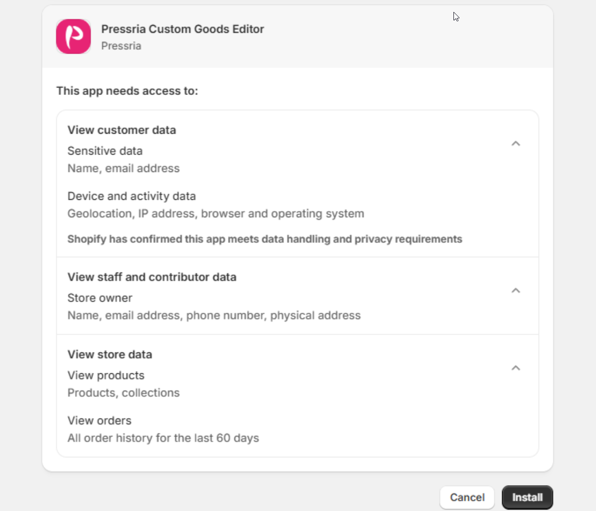
Shopify asks you to approve what the app can read before installing: customer data (name, email, and device/location data), store-owner contact details, your products and collections, and the last 60 days of order history.
Shopify's approval screen. Check the publisher reads Pressria before clicking Install.
2.2Finish setup Shopify only
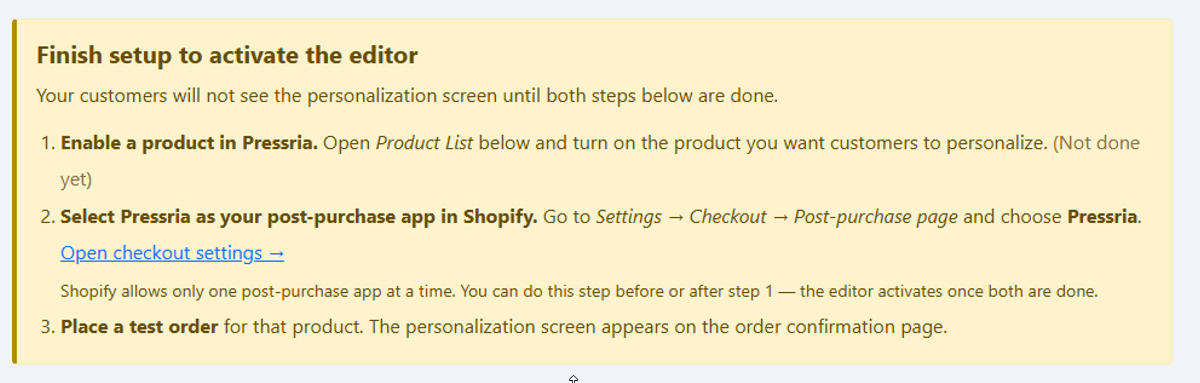
Installing the app does not switch the editor on. Until two things are both true, customers check out and never see a personalization screen — so the app opens on a Finish setup to activate the editor banner that tracks them for you and marks which are still outstanding.
The banner marks what is still missing — here, no product has been enabled yet. It disappears once setup is complete.
Enable a product. In Product List, turn on the product you want customers to personalize (section 3).
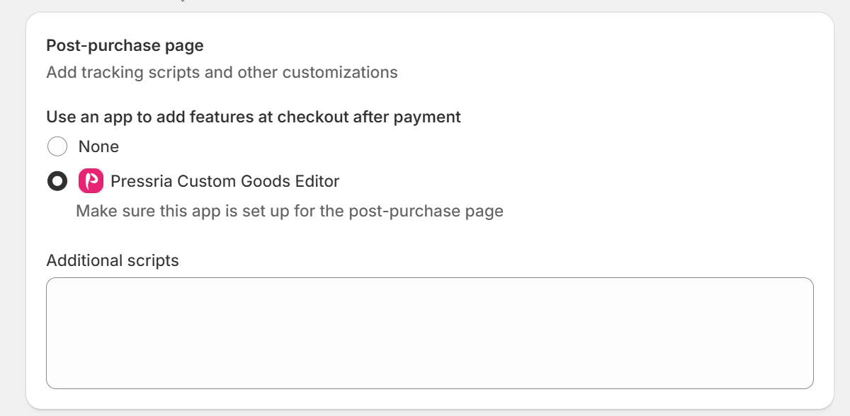
Make Pressria your post-purchase app. Go to Settings → Checkout → Post-purchase page in Shopify and choose Pressria. The banner's Open checkout settings link takes you straight there.
Set correctly. The default is None, so this is a step you have to take deliberately — installing the app does not claim the slot for you.
The order does not matter — the editor activates once both are done. Shopify allows only one post-purchase app at a time, so installing another app that claims that slot will take it from Pressria.
Then place a test order for that product. The personalization screen appears on the order confirmation page. Do this before you announce anything to customers; it is the only way to see what they will see.
2.3Install the plugin WooCommerce only
Install Pressria – Web to Print Product Designer for WooCommerce from the WordPress plugin directory, then activate it. A Pressria item appears in the WordPress admin menu.
Requirement
Plugin page
wordpress.org/plugins/pressria-for-woocommerce/
WordPress
6.5 or higher
PHP
7.4 or higher
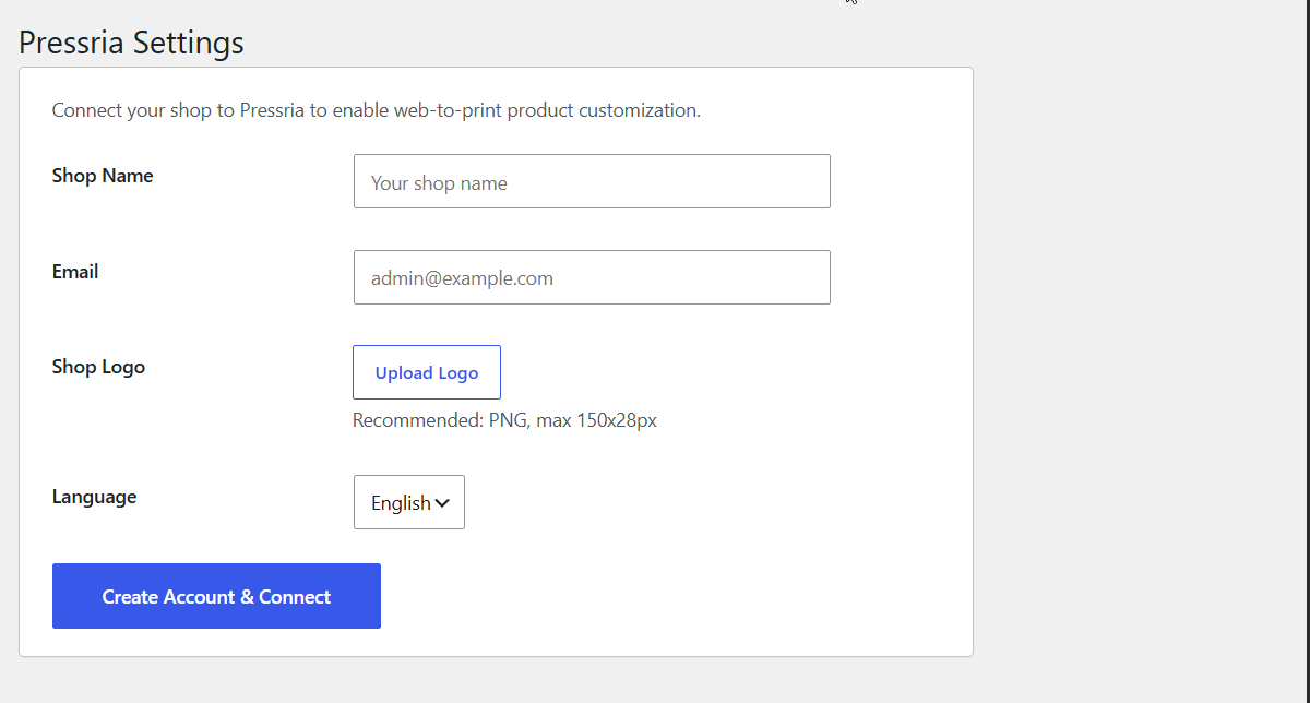
You do not need a Pressria account beforehand. After activating, open Pressria Settings in the WordPress menu and fill in the connection form — it creates the account and connects the shop in one step.
The first-run form. After connecting, this screen is replaced by the bridge described in 2.4.
Shop Name and Email — the administrator address for the Pressria account. Billing notices go here.
Shop Logo — PNG, max 150×28px. This is your shop's logo on the account, not the logo customers see in the editor; that one is set separately in Settings → Basic at 260×55px (7.1).
Language — the language registered for the shop.
Click Create Account & Connect. Activation itself only registers your site URL and an install token; this form is what registers the shop.
The plugin follows your WordPress site language, so a Korean-language site shows Korean labels and an English one shows English. The labels quoted in this manual are the English ones.
2.4Connect and sync your catalogue WooCommerce only
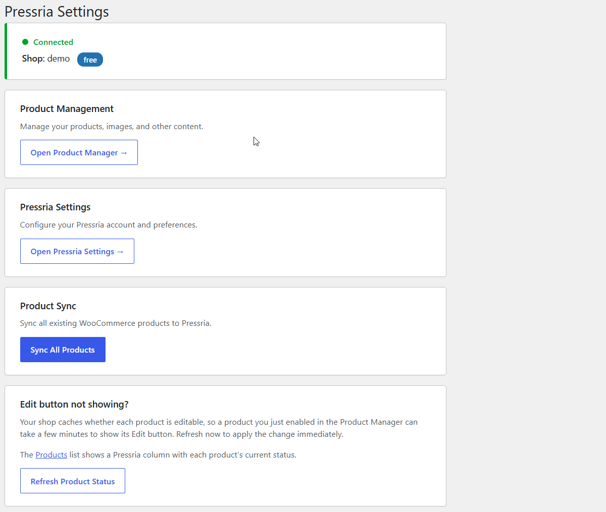
Pressria Settings in the WordPress menu is a bridge, not the app itself. The band at the top shows Connected, your shop name and your current plan; below it are four cards.
Check the band reads Connected first. Nothing below it works if the shop is not connected.
Open Product Manager → — the Pressria product manager, in a new tab. This is where you spend your time; everything from section 3 onward happens there.
Open Pressria Settings → — your Pressria account and preferences.
Sync All Products — pushes every existing WooCommerce product to Pressria in one pass. Run it once after installing, and again after a bulk product import, rather than enabling products one at a time.
Refresh Product Status — your shop caches which products are editable, so a product you just enabled can take a few minutes to show its button on the storefront. This applies the change immediately.
Your WooCommerce Products list also gains a Pressria column showing each product's current status, so you can see what is enabled without leaving WordPress.
Then check it from the storefront. Set one product up (section 3), open its product page as a shopper would, and confirm an Edit Design button sits beside Add to Cart. That is the only proof the chain works end to end; if it is missing, 9.3 covers why.
03Products
Turning a product in your catalogue into something a customer can personalize. Shared by both channels. Start at 3.1 — it routes you to either 3.2 or 3.3–3.7, and you will not need both. Two forward dependencies: keychain and stand dimensions come from 7.2–7.3, and template categories from 5.1, so set those up first if you have not.
3.1Enable a product
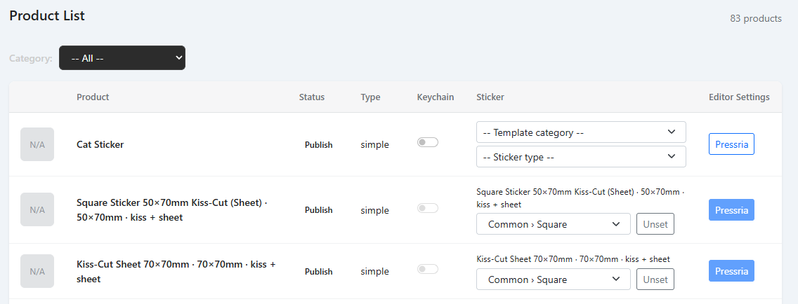
Product List shows everything in your store catalogue, whether or not Pressria touches it.
Read the row right to left. The Pressria button in the Editor Settings column is the one that matters:
Solid blue — the product is set up. Customers see the editor on it.
Outlined — not set up yet. Customers see an ordinary product.
The Keychain toggle and the Sticker column are a separate question: not whether the product is live, but how it gets set up. They put a product on one of two paths, and which path you are on decides which of the sections below you need.
No Keychain or Sticker setting
Keychain on, or a Sticker type chosen
A flat print product — a t-shirt, a phone case, a mug. The artwork is printed into a fixed area on an existing object.
A cut product. The artwork is the object's shape, so there is no area to print into.
You set it up in Setting Product: upload the mockup, define the print area, link a template category. Sections 3.3 – 3.7.
You skip the print area entirely. For a keychain, production detail comes from the gear icon beside the toggle — section 3.2. For a sticker, the type you pick carries the size and cut lines — section 3.8.
This is the fork worth getting right. Setting a print area on a keychain or a sticker is wasted work, and looking for a gear icon on a t-shirt will not find one.
Stores set up before sticker types existed may still show a single Die-Cut Sticker toggle instead of the Sticker column. It makes a free-form die-cut sticker (3.9) and nothing else.
Products are created and priced in Shopify or WooCommerce as usual. Pressria never adds products to your catalogue; it only enables the ones already there.
3.2Keyring Option Settings
For a cut product this is the setup. There is no print area to define — the design's own outline becomes the cut line — so what remains is the production detail, and it lives behind the gear icon beside the enabled toggle.
The gear opens Keyring Option Settings: the production choices offered to the customer for that product. Each row has a Select switch — leave it on to let the customer choose, turn it off to fix the value yourself.
Option
Values
What it changes
Size
From the base sizes in Settings → Keychain
The finished piece's size. Fixed locks it to one value.
Cutting Margin
2mm / 3mm
The gap between the edge of the artwork and the cut line — the clear acrylic border around the design.
Sides
Single / Double/Mirror
On Double/Mirror, the production PDF gains a back layer: the front artwork mirrored left-to-right, so it reads correctly from behind the acrylic.
Ring Count
1 / 2
On 2, a second hole is added at the bottom centre of the design.
Hole Size / Stand / Phone Grip One field, four product kinds — it decides what gets added to the cut shape.
2mm3mm4mm
A keyring. The number is the diameter of the hole punched through the acrylic.
Stand
No ring hole. A rectangular tab is generated at the bottom instead, which slots into a separate base. The tab slides left and right, so you can put it under the balance point rather than always at the centre. Base dimensions are store-wide — see 7.3.
Korotto
No hole and no separate base. The bottom of the cut line is flattened so the piece stands on its own.
None
Neither: no hole, no tab — just the cut shape. This is the setting for a phone grip, where the hardware attaches to the finished piece afterwards.
Ring Hole Position
Outside / Inside
Whether the ring sits outside the design or inside it.
Reset All Options clears every choice and re-enables all options in the customer's editor. Apply saves.
Picking Stand needs nothing else here. The stand's size options and the dimensions of its base come from your store-wide settings in 7.3, not from this panel.
Stand and korotto are the two options merchants mix up, because the difference is in the cut line rather than in anything you configure. Compare the bottom edge:
Stand — a tab protrudes from the bottom and slots into a separate base. Its position is adjustable left and right; put it where the piece balances, not necessarily at the centre.Korotto — the bottom is cut straight across and the acrylic stands unaided. No base part, no assembly.
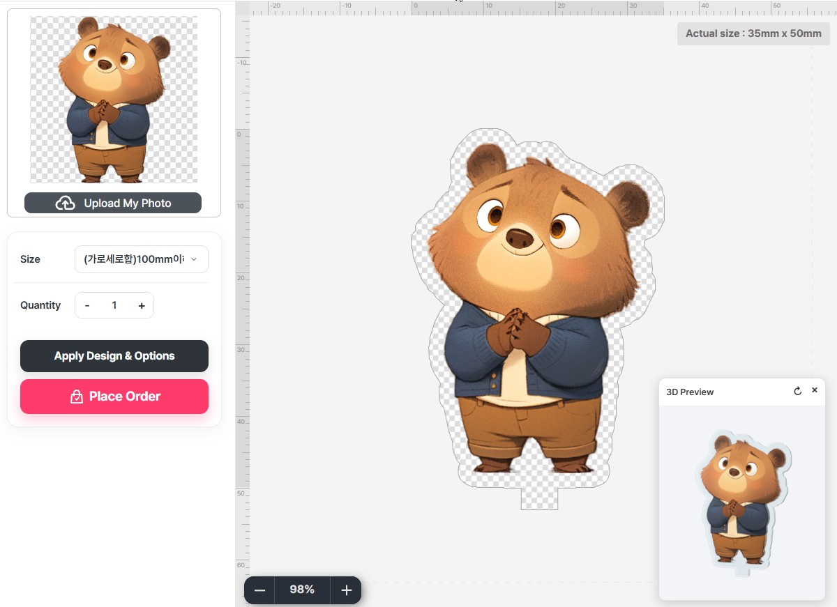
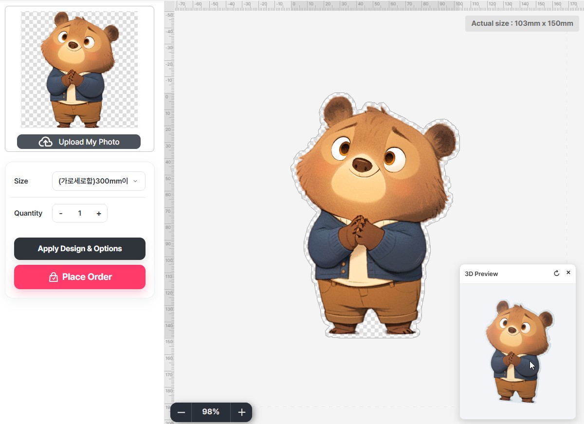
A korotto is a mini acrylic stand, small enough to sell as a set. You supply one image; the cut line and the white layer are generated for you, and several korotto nest onto one print-ready sheet automatically, so a set does not cost you a sheet per piece.
3.3Setting Product — Basic
The Pressria button in Editor Settings opens Setting Product. This and the four sections after it (3.3–3.7) are the printed-product path (3.1); for a keychain or sticker you have already finished at 3.2.
The Basic tab handles the mockup the customer designs on top of.
Product Background image — upload the product photo the customer designs on top of. Up to 2000 × 2000 px.
Background-free product — tick this for products with no mockup, where the design itself is the product.
Background varies by — see below.
When the mockup changes with a variant. A t-shirt sold in white and black needs a different photo for each: a customer picking black should see their design on a black shirt, not a white one.
Background varies by starts at None — same background for all options, which is right for most products: one mockup, used whatever the customer picks. Change it to the store option that drives the look — Color, say — and Pressria then expects one background per value of that option.
Uploading is two steps, and the second is easy to miss:
Upload the images. Each one lands in Uploaded backgrounds as a chip marked ? — uploaded, but not yet assigned to anything.
Tell it which value each one is. Click a ? chip and pick the value from the Color dropdown that appears.
A checklist above shows each value and whether its background has arrived yet, so you can see at a glance what is still outstanding.
The count multiplies by side. Two colours across a front and a back is four uploads, not two, and the Side counter reports only the side you are looking at. Finish one side, switch with the thumbnails at the bottom, and do the next. Save checks all of them, so an unfinished back surfaces as a blocked save rather than as a bad order.
You cannot save a half-finished product: Save is blocked while any value is missing a background, and the message names the one it is waiting for — Missing background image for: Black. The check covers every side, not just the one on screen, so a product that saves is a product whose backgrounds are complete.
How big to make the mockup. The limit is 2000 × 2000 px, and how close to it you should go depends on how much of the product the print area covers. Customers can zoom well past 100% — a minimap in the corner keeps them oriented — and at that magnification they are looking at your image, not at Pressria's rendering.
Print area covers most of the product — a t-shirt front, a tote. Little reason to zoom, so around 1500 × 1500 is plenty.
Print area is small against the product — socks, a phone grip, anything with a narrow band to design in. Customers will zoom in every time, so go nearer 2000 × 2000.
Background images count toward your Storage Usage (7.1), so size them for the product rather than uploading everything at maximum.
Put your instructions in the mockup. The background image is the one thing every customer looks at, so anything drawn into it is guidance they cannot miss. Shops selling awkward shapes — socks, pouches, anything with a small or oddly placed printable region — commonly outline the design area on the mockup itself and label it, and add a line of text above it for whatever gets asked most (that the design tool works best on a desktop, say). None of that is a Pressria feature; it is drawn in your image editor before uploading.
If you draw the design area onto the mockup, keep it matching the numbers you enter in Print (3.4). The drawn outline is decoration — the real boundary is those numbers — and a customer who trusts a line that sits somewhere else will send you artwork that does not fit.
The header identifies the product you are editing — its name, product code and price, read from your store — with Save and Delete on the right. Delete removes the Pressria setup, not the product itself, and a product must have its setup removed here before your store will let you delete the product.
Ticking Background-free product disables Product Background image: with no mockup there is nothing to sit behind the design.
3.4Setting Product — Print
The Print tab marks out where on the mockup the artwork lands, and what the printer receives around it. Printed products only — skip it for a keychain or die-cut sticker, where the design's outline is the shape and there is no area to fit artwork into.
Print Area
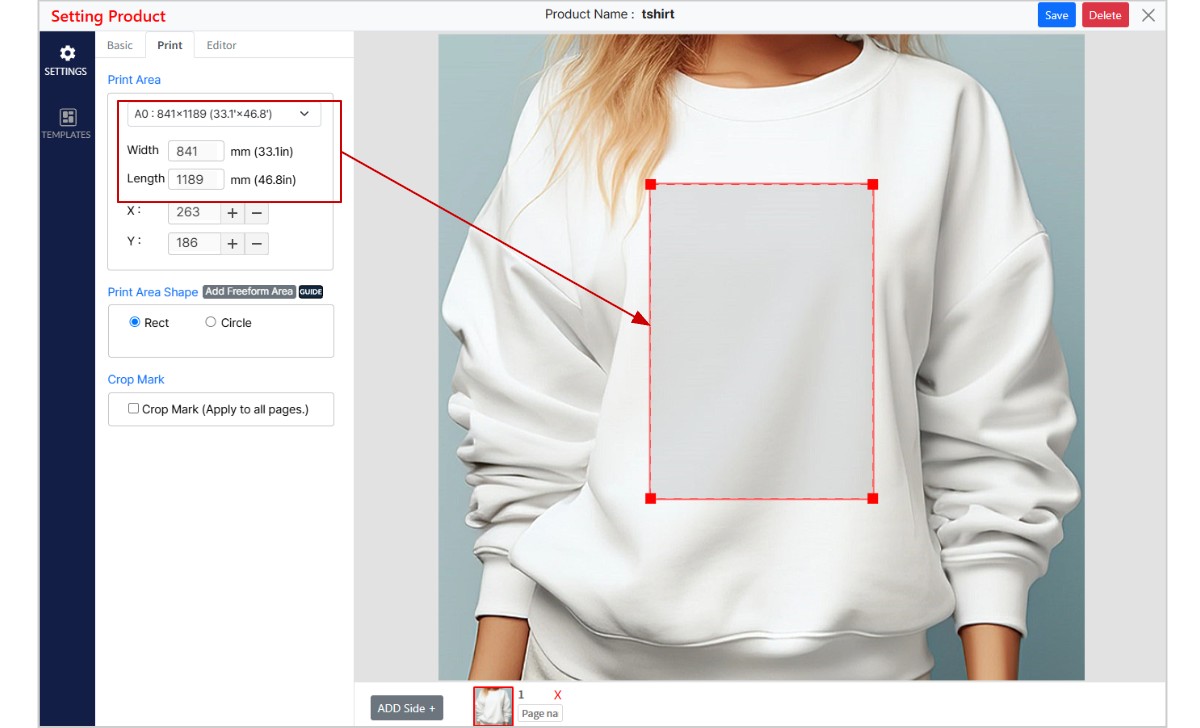
The real, physical size of the printable region. Pick a preset from Select Product Size, or type Width and Length in mm; the inch equivalent is shown beside each. X and Y position that region over the background image, and you can also drag the outline on the canvas.
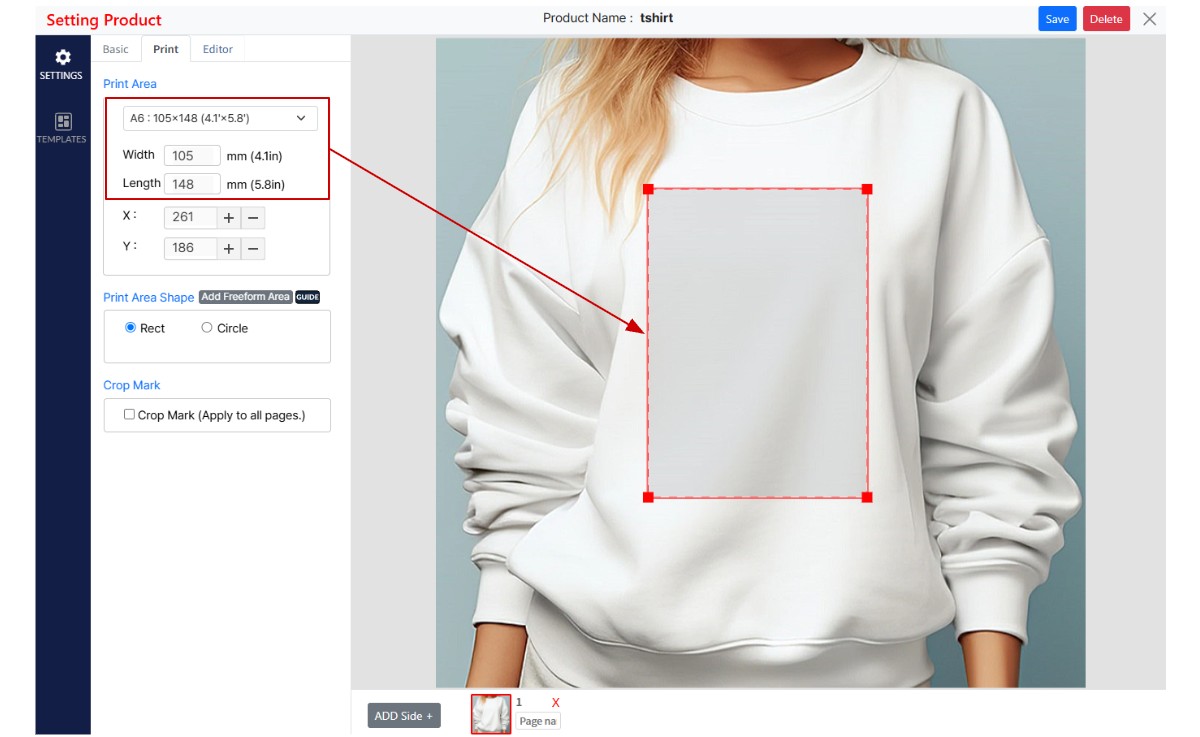
The box on the canvas is not the size. This is the one thing to understand here. Two products can show an identical rectangle on screen and print at completely different sizes — an A0 poster at 841 × 1189 mm and an A6 card at 105 × 148 mm look the same in this window, because the mockup is only a picture and the rectangle is drawn in proportion to it.
What you change
What it decides
Width and Length, in mm
The physical size that gets printed. Nothing else does.
Dragging the outline, or X and Y
Where and how large the area appears on the mockup — what the customer sees their design occupying on the product photo.
Because those two are independent, the same screen sets up a banner and a keyring equally well: the mockup handles the look, the millimetres handle the print. It also means dragging the box smaller does not make the product smaller — the print file is unchanged, and only the preview moved.
Print Area 841 × 1189 mm — an A0 poster.Print Area 105 × 148 mm — an A6 card.
Same rectangle on screen, eight times the printed size. Only the two marked fields decide what the printer receives.
So enter the millimetres first and treat the dragging as framing. The customer's editor takes those numbers as its ruler, and a print area entered at the wrong size makes every design built on it the wrong size too.
Print Area Shape
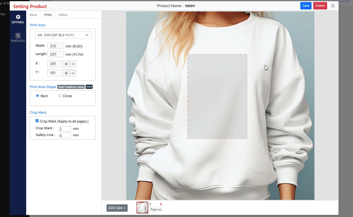
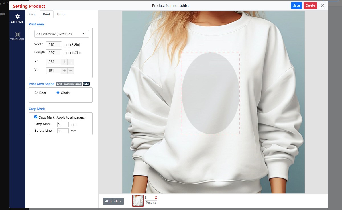
Rect keeps the printable region rectangular. Circle inscribes a rounded shape inside it, and that shape follows whatever Width and Length you entered: equal values give a true circle, unequal ones give an ellipse. For a round badge or coaster, set Width and Length to the same number first — leaving an A4 preset in place and switching to Circle produces an oval.
Rect — the printable region is the full rectangle.Circle — inscribed in that same rectangle. At 210 × 297 the result is an ellipse, not a circle.
Free Shape — supplying your own outline
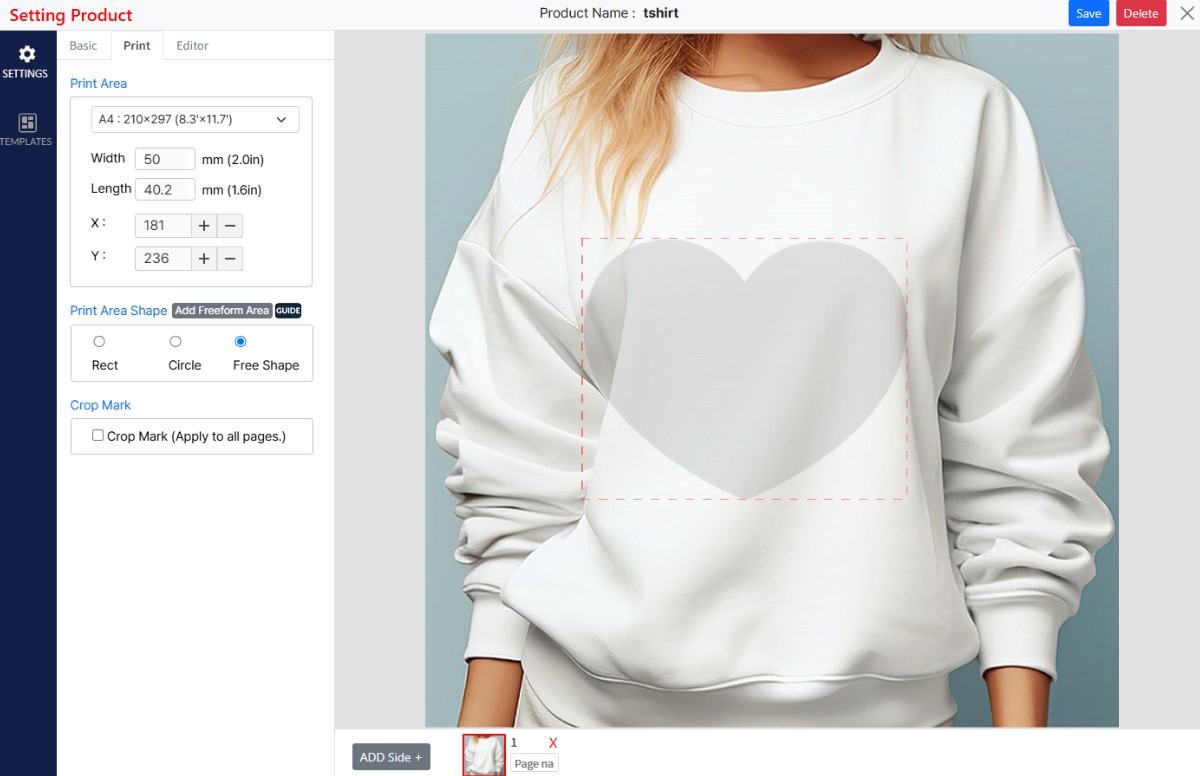
For anything a rectangle or an ellipse cannot describe: a heart, a shield, a jersey number panel, the printable window of an irregular product. You do not draw it here. You supply the outline as an SVG through Add Freeform Area, and the Free Shape radio is selected for you once the file is accepted. The GUIDE button beside it states the file requirements.
The file may contain one path, or two. Pressria reads them in the order they appear in the file and gives each a fixed job:
Order in the file
Becomes
First <path>
The product outline. Artwork is clipped to it, and it is the cut line.
Second <path>
The guide line shown to the customer in the editor. Advisory — it does not clip anything. Optional.
Third onward
Ignored.
Order in the file is the only thing that decides this. Layer names, ids, classes and colours are not read, and grouping makes no difference — a path nested three groups deep still counts as the first path if it comes first. So control the order in Illustrator's Layers panel before saving, and put nothing else in the file.
The most common failureOnly <path> elements are read. A rectangle, ellipse, circle, polygon or line drawn with Illustrator's shape tools is ignored completely — and if that is your first shape, nothing is applied at all. Convert every shape to a path before saving (Object › Path › Outline Stroke, or the equivalent for your object). A rounded-rectangle phone case drawn with the rectangle tool will fail silently for exactly this reason.
What happens on upload:
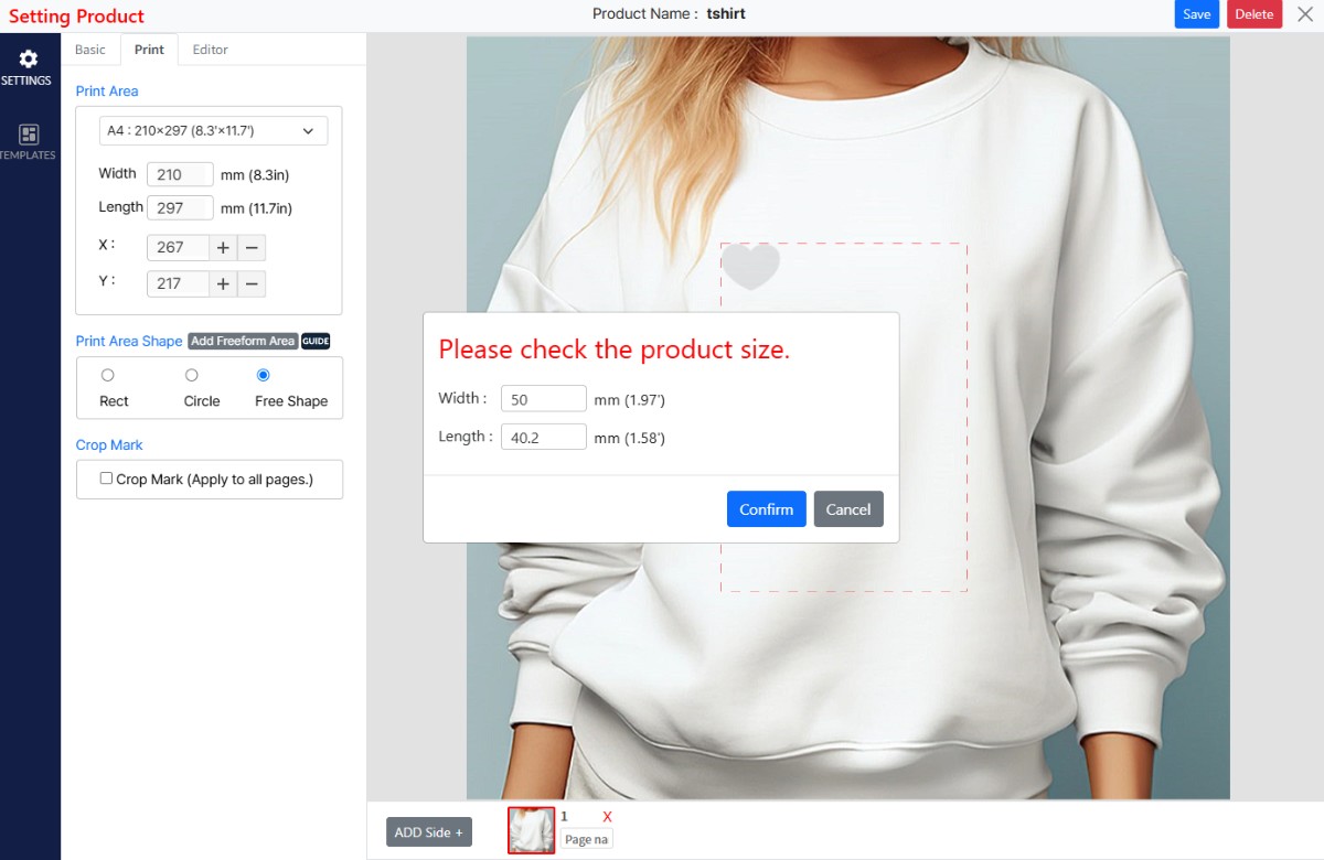
Pressria takes the bounding box of the first path — not the artboard — and converts it to millimetres.
A confirmation dialog shows that size and lets you correct it before it is applied.
On Confirm, Width and Length take those values and the outline replaces the rectangle on the mockup. Position it with X, Y or by dragging, exactly as before.
The size read from the file, offered for correction. Getting it right here matters more than anywhere else on this tab.Confirmed. Free Shape is now selected and the heart is the printable region.
Two things follow from the bounding box rule. Empty margin around the shape is ignored, so a small heart centred on a large artboard comes in at the heart's own size, not the artboard's. And the shape's proportions are fixed by the file — the sample heart arrives at 50 × 40.2 mm; entering 50 × 50 afterwards stretches it. If you need a different aspect, redraw it.
Draw the outline at its true printed size in Illustrator and save as SVG. Two working examples, deliberately built differently:
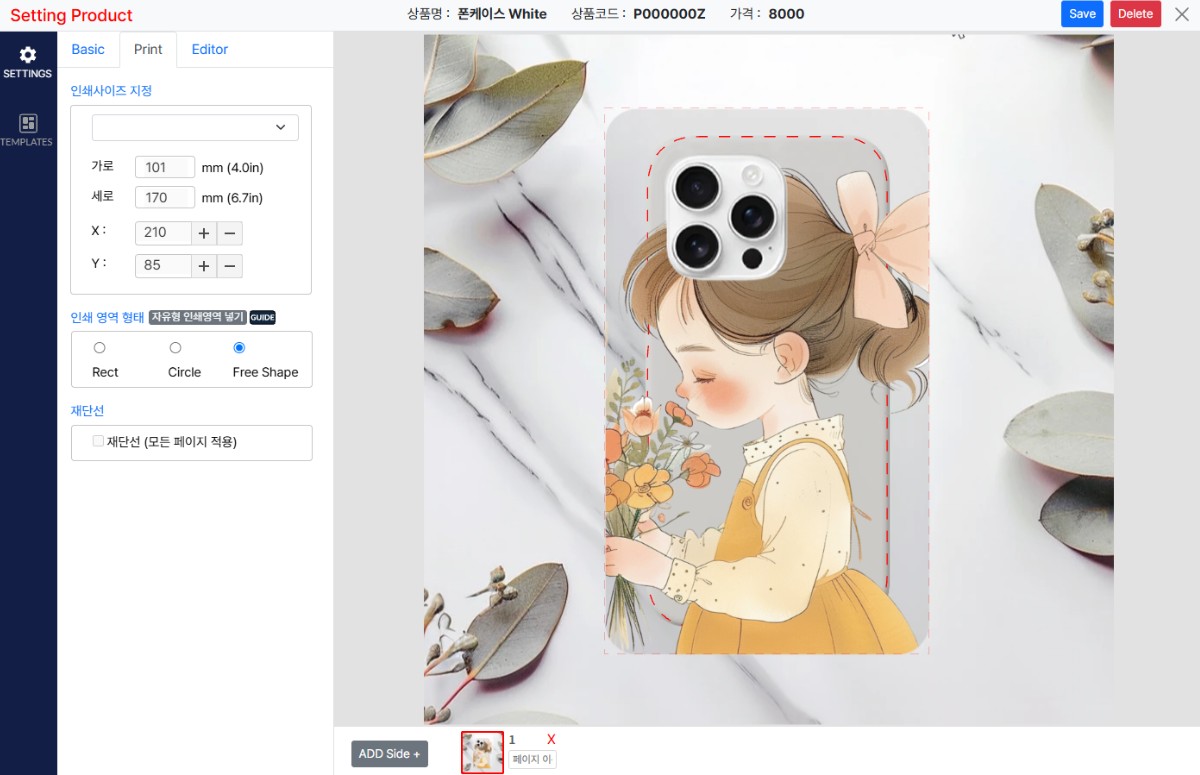
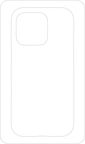
Two paths. Unfilled hairline strokes: the case outline, then a guide line inside it.
101 × 170 mm
Filled or stroked makes no difference — only the geometry is read, so build them however suits you.
Your side — the phone-case sample applied at 101 × 170 mm.
Why the second path exists. A phone case is not flat. The print wraps around the sides, so part of the printed area folds away from the front and is never seen straight on. The outer path is where the print stops; the guide is where the flat face ends. Everything between the two is real print that curls around the edge — and a customer who does not know that will centre their design on the wrong rectangle.
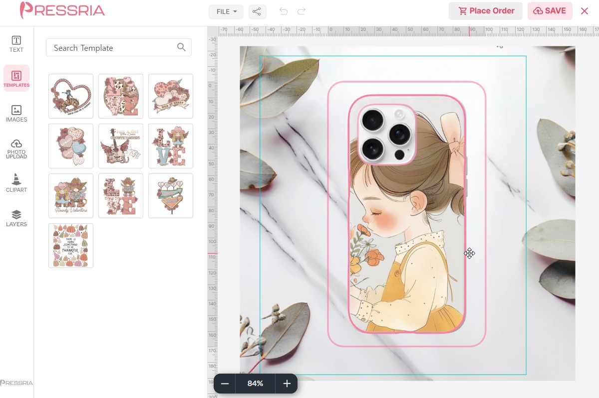
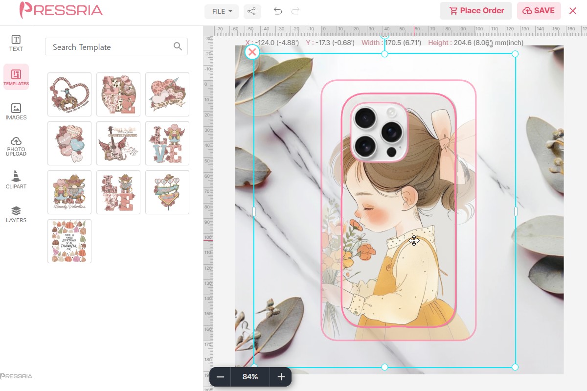
So the editor shows the difference rather than explaining it. Three states:
Customer does
Editor shows
Hovers over the design
Both outlines appear, and the band between the guide and the outer edge turns translucent — the customer can see how far their artwork really reaches.
Clicks it
The same, plus the selection frame and a live X / Y / width / height readout in mm.
Moves the cursor off the design
Everything disappears. The design is shown as it will look on the finished product: inside the guide, and nothing else.
Hover. Both outlines, band translucent.Clicked. Adds the selection frame and the mm readout.Cursor off. The finished product, nothing else.
The artwork here runs past the outline on the left — only what falls inside the outer pink line prints, and only what falls inside the guide is seen flat on.
Without a second path there is no band and no warning: the customer places artwork against a single hard edge with nothing to tell them how much of it will disappear around the side. On any product with a fold, a curve or a wrapped edge, the guide path is the difference between a design that arrives as intended and a reprint.
The same mechanism on a different product — the printable area follows the shoe's side panel. With nothing selected the guides disappear and the customer sees the product, not the setup, which is the payoff for getting the outline right.
Crop Mark
Tick Crop Mark (Apply to all pages.) to add trim guides to the production PDF, then set two distances in mm. Both are measured outward from the edge of the print area, so at the defaults the crop marks sit 2mm out and the safety line 4mm out, beyond them.
Crop Mark — how far outside the print area the trim marks sit.
Safety Line — how far out the safety line is drawn.
The safety line is a drawn guide and nothing more: it does not restrict where a customer can place artwork in the editor, and it does not change the print area. It is there for whoever handles the file at the print shop.
Ask your printer for both numbers rather than guessing — they are the marks that let the shop cut without clipping the design.
3.5Setting Product — Editor
The Editor tab controls what the customer sees while designing. Everything here is about their screen, not your production file.
Set Template Category — pick one category, and this product offers the templates in it. The list is the TEMPLATE categories you built in Contents (5.1), minus Default Category, which is never shown to customers. It is a single choice: one category per product.
Editor Menu — six checkboxes, one per icon in the rail down the left of the customer's editor. Clearing one removes that tool from their screen entirely.
Checkbox
Clearing it means the customer cannot…
Text
add or edit any wording of their own.
Templates
browse your ready-made designs — they start from an empty canvas.
Images
use the image library you uploaded.
Photo Upload
bring in a photo of their own.
Clipart
use your clipart library.
Layers
reorder or select objects through a layer panel.
Photo Upload is the one with real consequences. Leave it on and any file a customer owns can reach your printer; clear it and they can only combine what you supplied. Decide that per product rather than by habit.
Clearing most of them is a legitimate strategy, not a mistake. A shop selling one tightly controlled item — a printed area a few centimetres across, say — often leaves only Images on, so the customer picks from a curated library and cannot produce anything unprintable. Fewer tools also means a faster decision and fewer support emails.
Apply to all products copies the current selection across your whole catalogue — quick, and it overwrites what each product had.
Ruler — Show ruler in the editor puts the scale along the top and left of the customer's canvas, in mm or inch. Worth leaving on for anything where physical size matters to the buyer.
Guide Image — an instruction image of your own. Show automatically on first open puts it in front of the customer before they start, which is the cheapest place to prevent the mistakes you would otherwise answer by email.
3.6Sides
ADD Side + adds a printable face to the product — Front and Back, or as many as the product needs. Each side gets its own print area, its own background, and its own name, typed into the field under its thumbnail. The X on a thumbnail removes that side.
Each side becomes a page in the production PDF, in the order the sides appear here. The names you type do not travel into the file — they are for finding your way around the admin. So when you tell your print shop what to expect, describe it by page order: page 1 is the first side, page 2 the second.
That also means reordering or deleting a side changes which page is which. Settle the order before you start sending files to production.
Sides multiply with variants. If the product also varies its mockup by an option, every side needs a background for every value of that option, and Save is blocked until they are all there — see 3.3 for how the count works out.
3.7Templates
The TEMPLATES rail on the left of Setting Product sets the design the editor opens with. Pick a template here and it is already on the canvas, inside the print area, the first time a customer opens this product — they start from a finished design rather than an empty shirt.
The two dropdowns narrow the grid below them: the first picks a top-level TEMPLATE category — normally the product kind — and the second a sub-category inside it (5.1). Choose a template from the grid and it lands on the side you currently have selected, so a front and a back can open with different designs.
Not the same as 3.5. The two settings sound alike and do different jobs:
What it sets
Set Template Category (3.5)
Which templates the customer can browse once they are in the editor.
TEMPLATES (here)
Which single design is already placed when the editor opens.
Leaving this empty is a valid choice — the customer then starts with a blank print area. Setting it is worth doing when the product sells on a look rather than on the customer's own artwork, since an empty canvas asks the customer to have an idea before they have seen what the product can do.
3.8Sticker products
A sticker is set up from one place: the Sticker column of Product List. There is no print area to draw and no gear icon. The sticker type you pick is the whole specification — size, shape, cut lines, safe area — and it is copied onto the product at that moment.
The column holds two dropdowns. Use them in this order:
-- Template category -- — the top-level TEMPLATE category whose designs customers can browse on this product (5.1). Pick Empty Category if the product has no templates. Pressria will not accept a sticker type until this is chosen.
-- Sticker type -- — choosing one applies it immediately. The list refreshes and the product is live.
Once applied, the cell reads back what the product now is — the type name, the finished size, and the cut: die, kiss, or kiss + sheet. The Pressria button in Editor Settings turns solid and greys out, because there is nothing left to configure there.
The template category can be changed at any time from the same cell. It only decides what customers can browse, so orders already placed are unaffected.
The sticker type cannot be changed in place. Press Unset and choose again.
A product already set up another way — as a keychain, or as a printed product through Setting Product — has the cell locked. Undo that setup first.
The Sticker column appears once stickers are enabled for your store. If you do not see it, contact Pressria.
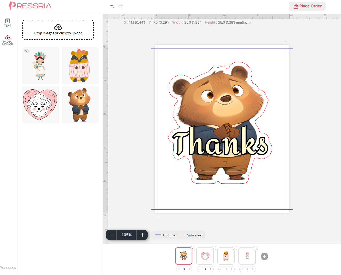
Before and after: the two dropdowns on a product with no type, and the summary line on one that has been applied.
Reading a sticker type
The list holds Pressria's presets plus any you have made yourself (7.4). The name tells you most of what you need: Circle Sticker 50mm Die-Cut, Kiss-Cut Seal 40×40mm, Kiss-Cut Sheet A5.
Sizes are the finished size — what the customer holds after cutting. The page they design on is slightly larger, by the cut margin on every side, so artwork can run to the edge without a white rim.
Die-cut cuts through the sticker and its backing: every sticker comes out as a separate piece.
Kiss-cut cuts through the sticker only and leaves the backing whole, so the stickers stay on a sheet and peel off. A kiss-cut product always has a second, die-cut line as well — the one that trims the sheet itself.
Circle Sticker 40–80mm Square Sticker 40×40 · 50×50 · 70×70mm Rectangle Sticker 50×70mm Rounded Square Sticker 40×40 · 50×50 · 70×70mm Rounded Rectangle Sticker 50×70mm — all ending Kiss-Cut (Sheet), or Kiss-Cut (Sheet) Set
The shape, kiss-cut, plus a die-cut sheet edge
One shaped sticker on a small backing sheet; a set holds several designs per order
Every kind prints its cut lines into the order PDF as spot-colour paths, separate from the artwork, named with the values in Settings → Sticker (7.4). Set those to what your print shop's cutter expects before the first order.
3.9Free-form die-cut stickers
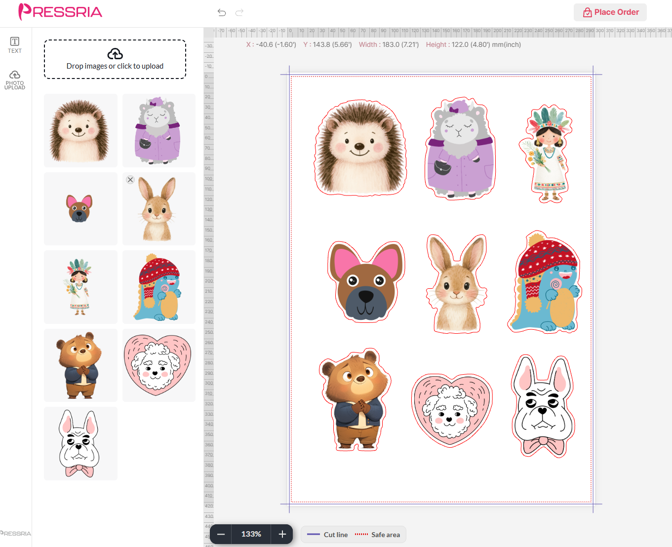
The customer places one or more images on a sheet, and Pressria draws a cut line around each one as they go. The artwork's outline is the sticker's shape, so a cat comes out cat-shaped.
The cut line keeps an even distance from the artwork — the white border around each sticker. Pressria presets use 2 mm; in your own presets it is Cut offset (7.4).
Only the outer outline is cut. A gap enclosed by the artwork — the inside of a ring, the space between a handle and a mug — stays part of the sticker.
Pieces placed very close together merge into one sticker with one cut line, rather than leaving a sliver the cutter cannot handle.
The sheet itself is trimmed a little inside the page edge.
The editor stops orders that would not cut cleanly. It shades the problem area red and explains why when:
two separate stickers come closer than the minimum spacing (Cut spacing, 7.4),
a sticker is smaller than the minimum size the cutter can handle, or
artwork crosses the safe area.
While any of these remain, the customer cannot add the design to the cart. That is intentional: each of these produces a sticker that tears, falls out or is cut through.
Nine images, nine cut lines. Each line follows its image's outline at an even distance; the dotted line is the safe area. Uploaded images wait in the left panel until they are placed.Too close: the danger zone is shaded red and the order is blocked until the stickers are moved apart, resized, or brought back inside the safe area.
3.10Seals and kiss-cut sheets
The cut works exactly as in 3.9 — traced around the artwork, merged when pieces touch, blocked when too close or too small — with one difference: it is a kiss cut. The stickers stay on the backing, and the sheet as a whole is die-cut at its edge. This covers two groups of types:
Seals — small peel-off sheets, one design each: Kiss-Cut Seal 38×48mm, Kiss-Cut Seal 40×40mm, Kiss-Cut Seal 50×40mm, Kiss-Cut Seal (Large) 70×90mm and Photocard Seal 85×55mm. Because the pieces are small, the rules are scaled down: a 1 mm border and smaller minimum sizes.
Kiss-cut sheets — larger sheets that hold many stickers: Kiss-Cut Sheet 70×70mm, 85×85mm, A6, A5, A4, and for US stores US Letter 8.5″×11″, Half Letter 8.5″×5.5″ and 4″×6″ (with a 3 mm border, the US bleed convention).
One order can hold several designs. A page bar along the bottom of the editor lets the customer add a design with +, remove one with ×, and set how many of each to print with − n +.
Max pages caps the total quantity, not the number of designs: three designs at two copies each use six of a cap of ten (the default). When the cap is reached, adding a design and raising a quantity are both refused. Set your own cap in a preset (7.4).
The print file repeats each design as many times as its quantity — three of one design and two of another arrive as five pages, same designs next to each other — so what the press receives is exactly what the customer counted. Your store, on the other hand, sees one line item however many seals were made. Price the product as a set: up to 10 seals at one price, with Max pages set to match.
The page bar: each thumbnail is one design, with its own quantity. The quantities together count against Max pages.
3.11Die-cut shapes — circle, square, rounded
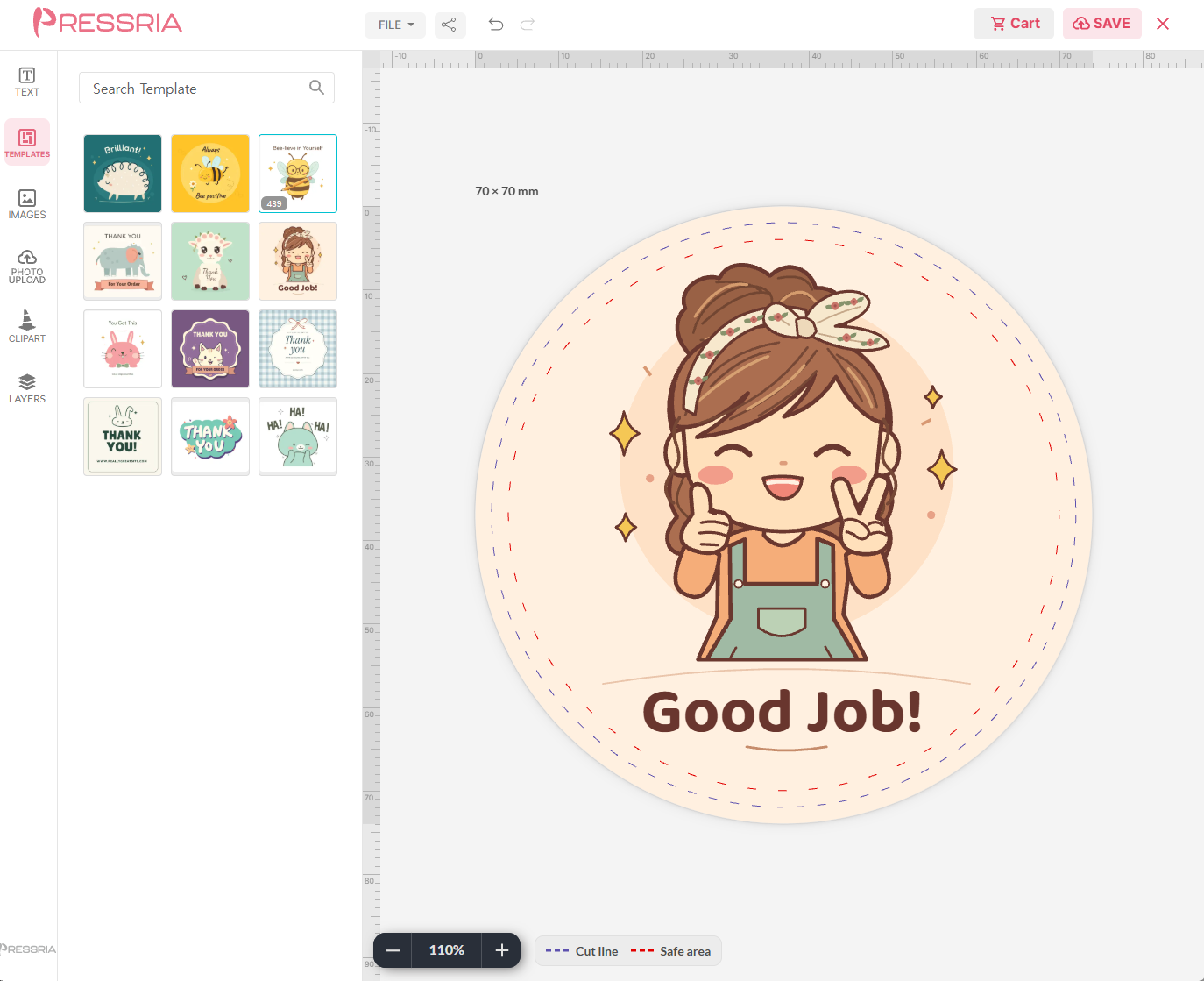
Here nothing is traced. The shape is the cut line, and the customer designs inside it. The canvas itself is shape-cropped, with a little bleed past the cut, so nothing can be placed where it would not print; every sticker comes out as a separate, identically shaped piece.
Circle Sticker — 30, 40, 50, 60, 70, 80 mm; 2″, 3″, 4″ in the US set.
Square Sticker — 40×40, 50×50, 70×70 mm; 2″, 3″, 4″, 5″ in the US set.
Rectangle Sticker — 50×70 mm.
Rounded Square Sticker and Rounded Rectangle Sticker — the same with 3 mm rounded corners: 40×40, 50×50, 70×70 mm and 50×70 mm. The corner radius comes with the type and is not something the customer or you adjust.
The bleed around the shape is 2 mm on the metric types and 3 mm on the inch types. The editor shows two guides. The outer one is the cut; the inner one is the safe area — keep text and faces inside it, because a cut drifts by a fraction of a millimetre on any machine. Backgrounds should run all the way to the page edge, past the cut, so there is no white rim if it drifts outward.
This is also the kind that templates suit best: a fixed shape means every customer starts from the same canvas. Link a template category in the Sticker column (3.8) — designs made for the shape's finished size fit directly, including those made in ChatGPT (5.8).
A 70 mm circle opened from a template. The outer dashed guide is the cut, the inner one the safe area; the templates on the left come from the category linked in the Sticker column.
3.12Kiss-cut shapes
Circles of 40–80 mm, squares and rounded squares of 40×40, 50×50 and 70×70 mm, and rectangles and rounded rectangles of 50×70 mm, named … Kiss-Cut (Sheet). The shape is kiss-cut, and a die-cut rectangle trims a small backing sheet around it — so each sticker arrives on its own peelable card rather than loose.
For the customer nothing changes: they design inside the shape, and the sheet edge is not shown, because the corners of the backing outside the shape always print blank. For the print file there are now two cut lines, one of each spot colour from 7.4 — make sure your print shop's cutter is set up for both before selling one of these.
How the numbers fit together, for a 40 mm circle:
Line
Inset from page edge
Result
Page
—
48 mm square
Sheet edge (die-cut)
2 mm
44 mm backing
Sticker (kiss-cut)
4 mm
40 mm circle — the finished size
Safe area
6 mm
36 mm — keep text inside this
Single or set
Every kiss-cut shape also comes as a set, named … Kiss-Cut (Sheet) Set. The shape, the sizes and the lines above are identical; only the editor differs.
Single — the customer designs one sticker. How many are printed is the order quantity in your store. Suits logos, labels, the same sticker many times.
Set — the page bar from 3.10 appears under the canvas. The customer adds, removes and reorders designs, and gives each its own quantity. Max pages caps the total quantity, 10 by default, exactly as for seals. Suits character packs, name packs, mixed giveaways.
As with seals, the print file repeats each design as many times as its quantity — three of one design and two of another arrive as five pages, same designs next to each other — and every page carries the same two cut lines. Your store sees one line item, so price a set as a set: up to 10 stickers at one price, with Max pages set to match.
Not to be confused with Kiss-Cut Sheet (3.10). There, the customer's artwork decides the sticker shapes and many fit on one sheet; here, the type decides a single shape.
04Illustrator plugin
Optional, but it gates most of section 5. Every product in section 3 sets up from the admin with no design software at all. The plugin is what fills your content library — templates from .ai and .eps files, and the text, images and clipart your customers pick from. The one exception is templates made in ChatGPT, which upload straight from the browser (5.8). Skip both sections if you have nothing to stock the library with yet.
4.1Install from Creative Cloud
Open the Creative Cloud Desktop app and go to the Stock & Marketplace tab in the left-hand menu. Search for pressria, choose Pressria Plugin under the Plugins section, and click Install.
Don't confuse it with the Pressio font listed under Adobe Fonts.
Or go straight to the listing:Pressria Plugin on Adobe Exchange. It is the same plugin — the listing's install button hands off to the Creative Cloud Desktop app, which does the installing, so that app still needs to be on your computer. The listing is also the place to check the current version and which Illustrator versions it supports.
4.2Run from the Extensions menu
In Illustrator, go to Window → Extensions → Pressria. The menu entry carries the installed version number after the name; ignore it and pick whichever Pressria entry is there.
4.3Authenticate your domain
On first launch the panel asks for a domain. You are not registering anything here. Your store's domain was registered automatically the moment you installed the Shopify app or activated the WooCommerce plugin — this field just tells the panel which of those registered stores to work with.
So there is no setup step to go and do first. Enter the domain your store was connected under:
Channel
The registered domain is
Shopify
The domain Shopify issued you, ending in .myshopify.com. Not your custom domain, even if that is the one customers see and the only one you ever use.
WooCommerce
The domain your WordPress site runs on — the one you activated the plugin on.
The Shopify case is the one to watch. A store on a custom domain has two addresses and only the .myshopify.com one works here; you can read it out of your Shopify admin's address bar. Entering the custom domain fails.
Type it as a full address including https://, the way the field's own example shows, then click Confirm. If that is rejected, enter it again without the protocol — www.abc.com rather than https://www.abc.com. Depending on when your shop was registered, Pressria may hold the domain in either form, and the plugin matches the stored value literally.
Once accepted, the panel opens straight to the Pressria screen from then on, and the Upload (Ai, Eps) File button in Contents becomes available.
To point the plugin at a different store later, use Change Domain at the top of the panel. One Illustrator installation serves one store at a time, so running two shops means switching here between them.
The domain selects a store; it does not grant access to one. Uploading also requires that you are signed in to the Pressria admin for that store, so typing a domain you do not administer will not let you upload into it.
05Contents
Stocking the library your customers design from — templates, text, images and clipart — organized into categories. Almost everything here uploads from Illustrator through the plugin (section 4); simple vector templates made in ChatGPT can also go in straight from the browser (5.8).
—Why this runs through Illustrator
You build your designs in Illustrator, where you already work, and upload them as files rather than rebuilding each one in a browser. The file conventions in 5.3 are what make that possible: because a template file states its own structure, a library of hundreds of designs goes in as a batch.
That trade is the point of this section. You keep working in Illustrator, where your artwork already lives, and follow a small structure when you save. What you get back is bulk import, and designs that keep their vector quality all the way to the print file.
If you do not work in Illustrator, there is a second route for one kind of content: a template drawn as an SVG by ChatGPT — flat vector artwork plus text — can be uploaded directly, with no plugin and no layer structure to follow (5.8). Anything with photographs or detailed effects still goes through Illustrator.
5.1Categories
Your library holds four kinds of content, and the dropdown at the top of Contents switches between them. Each type keeps its own separate set of categories.
Type
What goes in it
TEMPLATE
Complete ready-made designs, from .ai / .eps.
TEXT
Editable wording the customer can change.
IMAGE (PHOTO)
Raster images — jpg, png.
CLIPART
Vector artwork.
Add a category with Category Name → ADD. Each category chip carries three controls:
The number — how many items the category holds.
e — rename it. Opens Change Category Info.
x — delete the category. Safer than it looks: the contents are not deleted with it, they move to Default Category. The confirmation says so.
Only TEMPLATE has two levels.TEXT, IMAGE (PHOTO) and CLIPART have a single flat list — those screens have no Sub Category Name field at all.
The two levels under TEMPLATE are meant to be used a particular way, and following it keeps the customer's browsing sensible:
Top level = the kind of product.TShirt, PhoneCase, Poster, Keychain, BusinessCard. This is the level a product points at in Set Template Category (3.5), so it should match how your catalogue is divided — a t-shirt template is no use on a mug.
Sub-category = a theme within it.Animal, Coffee, Lettering, seasonal sets.
To add one, click the parent category first — it highlights — then type into Sub Category Name and press ADD. The sub-category list belongs to whichever parent is selected, so nothing appears there until you have picked one.
Sub-categories are what the customer browses. This is the part worth getting right, because it is visible to buyers. A product points at one top-level category in Set Template Category (3.5); the sub-categories inside it then become the sections down the template panel of the customer's editor, under those exact names. Name a sub-category Coffee and your customers see a Coffee section.
Their order carries through too, and you set it by dragging the category chips into the order you want. Put whatever sells first at the top; that is the section customers see without scrolling.
Two categories exist before you create anything.
Default Category — present in all four types, and never shown to customers.
Common — created under TEMPLATE only.
Default Category is the holding area, and it does two jobs.
Before publishing. Upload here while you are still checking the artwork, then move it into a real category once it is ready to sell.
After publishing — the important one. To stop offering something, move it back here instead of deleting it. Customers have already ordered from it and those orders still reference the content; retiring it hides it from the editor while leaving those records intact. Deleting it does not.
So the rule is retire, don't delete. Deletion is for content that never reached a customer.
The same safety net catches category deletion: removing a category moves everything inside it here rather than destroying it, so reorganizing your categories is a low-risk operation.
This is also why Default Category is absent from Setting Product → Editor → Set Template Category (3.5) — only categories customers can reach are offered there. And if something you uploaded is not appearing in the editor, this is the first place to look.
5.2Upload a template
The Illustrator file button under UPLOAD only works while the Pressria plugin is running in Illustrator and authenticated against this store's domain (4.3). The button's state is the signal: greyed out with Plugin not connected underneath means Pressria cannot reach an authenticated plugin; it turns live, reading Ai, Eps, once it can. Check that before anything else.
The second button, AI (ChatGPT) SVG, does not need the plugin and is covered in 5.8.
Greyed out with the plugin running means Illustrator is authenticated to a different domain: open the Pressria panel in Illustrator, click Change Domain, and enter the domain for the store you are uploading to (9.2 covers the causes). Once the button is live, open your artwork in Illustrator and upload.
5.3How a template file must be built
An arbitrary Illustrator file cannot be dropped into Pressria. The editor has to know which parts of a design a customer may change and which are fixed, and an .ai file on its own does not say. So the plugin reads a fixed structure instead: three layer names, each with its own rule about what may sit inside it. Build the file to that structure and it comes through; ignore it and parts of the artwork are silently not picked up.
Only these three layer names are read. Content on a layer named anything else is not recognized.
The three do not behave identically, and the reason is worth holding on to, because it makes the table below something you can reason about instead of memorize:
Text and images are already single objects. Where one ends is not in question, so nothing has to mark it.
Clipart is an arbitrary set of vector shapes. Nothing in the file says where one piece of clipart stops and the next begins — so a group is what draws that boundary. That is the whole reason clipart must be grouped and text must not.
Layer
What it accepts
What is ignored
clipart
Groups only. Each group becomes one clipart object the customer can move or swap.
A bare path, compound path or image sitting directly on the layer — even though it is visible in Illustrator.
text
Text objects only, placed directly on the layer.
Groups, paths, and sub-layers. Do not group your text.
image
Images only.
Anything that is not an image.
The clipart rule is the one that catches people, because a path drawn straight onto the layer looks completely normal in Illustrator and simply does not arrive. If a clipart element is missing after upload, it was almost certainly not grouped.
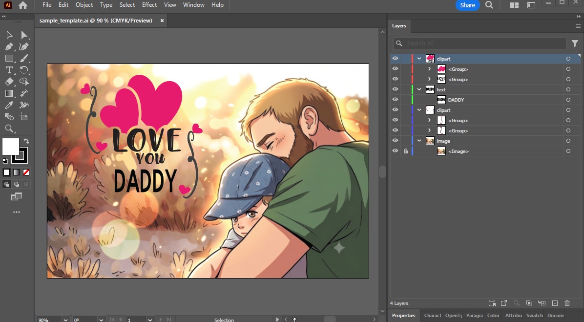
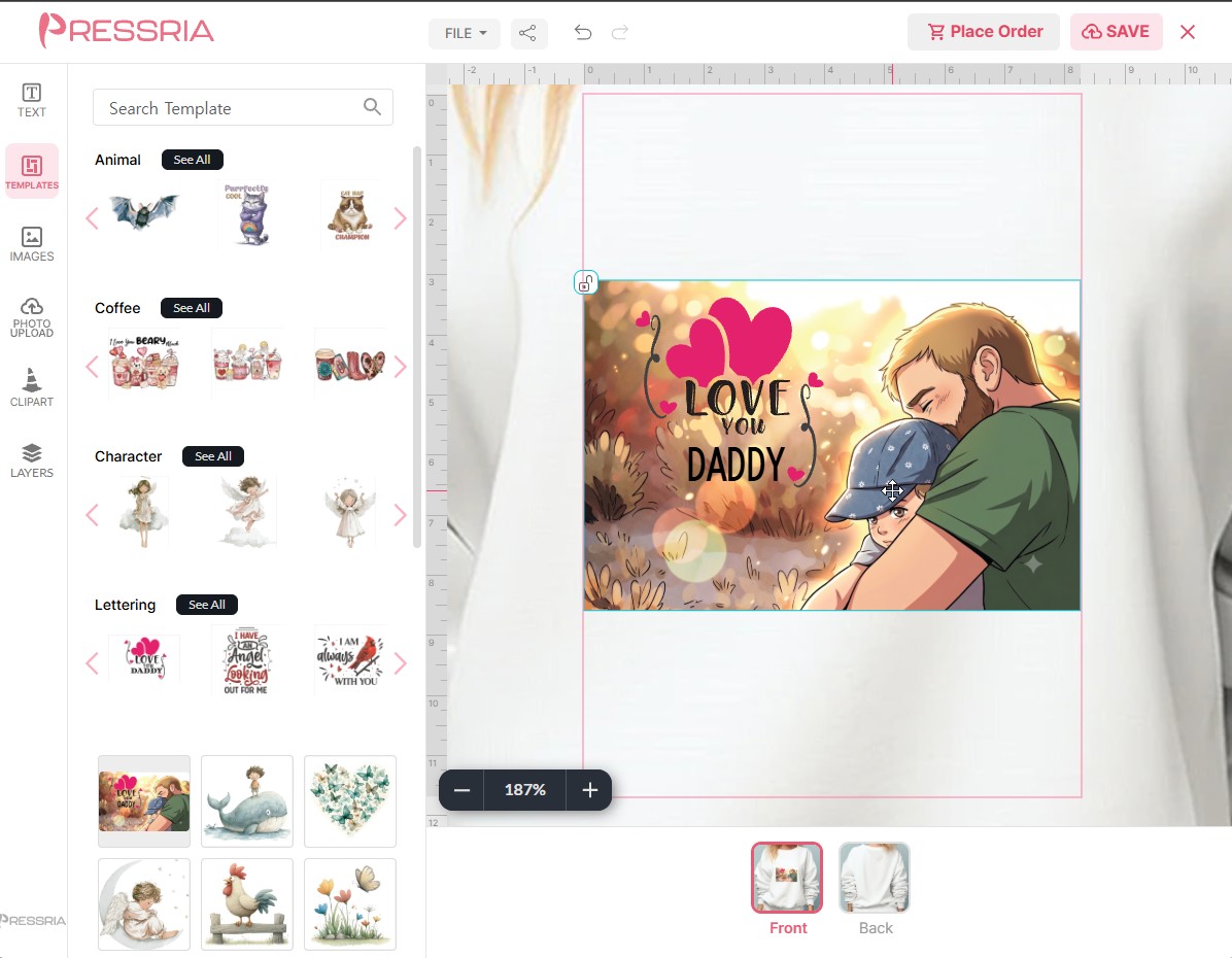
A template file that follows the rules. Four layers, three names, and nothing loose: clipart in groups, text as a bare text object, the background on image and locked.The same file in the customer's editor. What you separated in Illustrator is what they can move; what you locked, they cannot.
The Layers panel is the specification. If a piece is not where the table says it should be, it will not appear on the right.
Open the file itself. That template is downloadable as sample_template.ai. Reading the rules takes longer than opening a file that already follows them, and you can strip it back to an empty shell and build your own on top. The background in it is a placeholder — replace it with artwork you hold the rights to before you sell anything built on this file.
Keep clipart vector. That is what the layer is for: vector artwork stays sharp when the customer zooms in, and a customer zooming in is normal (3.3). A group is still accepted if it contains a raster image — it counts as one clipart either way — but the print quality of the finished order suffers, so avoid it.
Repeat a layer name as often as you need. The sample above has two separate clipart layers, and that is fine for all three names. Their order in the Layers panel is the order the customer sees in the editor's own layer list, so stack them the way you want them presented.
Locking carries over. An object locked in Illustrator arrives locked in the customer's editor. Use it for the parts of a template that hold the design together — the background in the sample is locked, so a customer cannot drag it out of place while editing the lettering on top of it.
5.4Text and fonts
Text is a different kind of thing from a template. A template is a whole design, complete in itself. A text item is a lettering element the customer drops onto a design — "Thanks millions" set in two fonts on two lines, ready to place and re-word. So the file rules are different too.
Two rules, and neither is the one from 5.3:
Only the first layer is read. Its name does not matter — unlike a template, where the name is everything. Anything on a second or third layer is ignored.
Each group inside it becomes one text item, and only text objects within a group are recognized.
The grouping is what lets a text item be more than one line. A group holding a single phrase is perfectly valid, but a lettering combination — two lines, two typefaces, two colours — is one design decision, and the group keeps it together so the customer places it as one piece. What you group in Illustrator is exactly what appears as a tile in the customer's text panel.
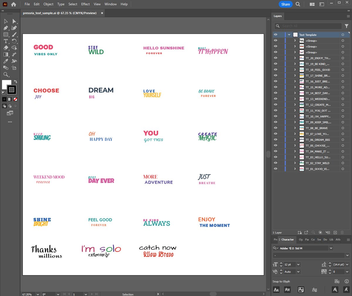
Open the file itself. A ready-made text file is downloadable as pressria_text_sample.ai: a single layer of lettering combinations — GOOD VIBES ONLY, STAY WILD, Thanks millions and more — each one its own group, so each becomes one tile in the text panel. Every face in it (Poppins, Caveat, Pacifico, Bangers and the rest) comes from the Google Fonts library described below, so it uploads as it is. Duplicate a group, re-word it and change the fonts to build your own set.
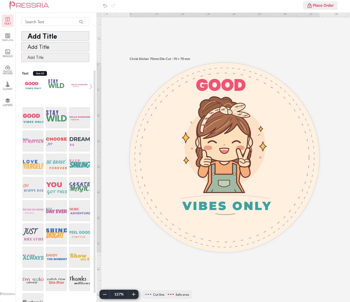
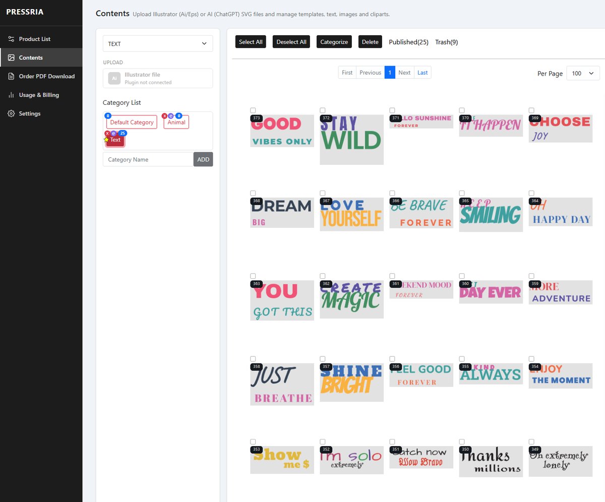
In Illustrator. One layer, one group per lettering. The layer and group names (Text Template, TT_01_GOOD_VIBES) are only for you — Pressria does not read them.In the customer's editor. Each group is a tile in the TEXT panel. Placed on a design, it is still live text — the customer re-words it in the same fonts.
Between the two, in Contents with TEXT selected: one item per group, filed in the category you uploaded into. The number on each tile is the item’s ID — type 373 into the editor’s Search Text and only that item comes up (5.7).
Fonts are restricted, and this applies to templates as well. Pressria only accepts fonts from its own library; a design set in anything else will not upload, and you cannot supply a font file of your own.
Even if you hold a commercial licence for it. That is the part worth understanding, because it is not a matter of trusting you. The licence you bought covers you designing with the font. Putting the font file on Pressria's servers so that it renders in your customers' browsers is embedding — usually a separate grant, sold separately, and permitted by some EULAs and not others. Pressria cannot read your licence to find out which, and the file would be sitting on Pressria's infrastructure serving third parties, so the exposure would not be yours alone. Hence the library.
The library is drawn from Google Fonts, chosen for exactly this reason: those faces are licensed for commercial use and embedding from the outset, so nothing you build on them can come back at you later.
It is not all of Google Fonts. Search the editor's font list for a typeface before you design with it — that search is the only authoritative answer, and checking one font takes a moment. Checking after you have built a set of designs does not: an unsupported font is refused at upload, and the fix is redoing the artwork.
If you must use your own font, convert the text to outlines in Illustrator and upload it as clipart instead. It becomes vector shapes, so no font file is involved and no licence question arises — provided your licence covers the printed output, which is the ordinary use you paid for. The trade is that it is no longer text: the customer can move, resize and recolour it, but cannot re-word it. Use it for lettering that is meant to be fixed, and keep the TEXT library for wording customers actually change.
5.5Images
Images are the exception to everything above: there is no Illustrator file and no layer structure. You pick image files straight from a folder on your computer, several at once, and they upload as they are. Nothing needs to be built or grouped — an .ai file would only be in the way for a photograph.
The plugin still has to be running, and the reason is worth knowing rather than guessing at: it generates the thumbnails the library and the customer's editor need, and uploads them alongside each image. That is the only work Illustrator is doing here.
Each image must be 10MB or less. This is a hard limit, not a guideline — a larger file is refused. A camera original or a layered export will often exceed it, so reduce the file before uploading rather than after being turned away. Settings → Basic shows how much of your image quota and storage you have used (7.1), and the thumbnail generated for each image, roughly 50KB, counts toward that storage.
5.6Clipart
Clipart is the same kind of thing as a text item and follows the same two rules as 5.4: only the first layer is read, whatever it is called, and each group inside it becomes one piece of clipart. Nothing outside a group is picked up.
What differs is what may sit inside the group: anything. Paths, compound paths, several of each — one file can mix both freely, and each group arrives as one object the customer can place, move and scale.
Keep it vector. A group containing a raster image is still accepted as one clipart, but the customer can scale clipart up, and when the order PDF is produced that raster is what limits the print quality. Vector has no such ceiling. If you need a photographic element, upload it as an image (5.5) rather than burying it in clipart.
5.7Managing what you have uploaded
The panel to the right of the category list shows the contents of whichever category is selected, each item with its own ID. Tick items — or use Select All / Deselect All — and act on them with the two buttons above:
Categorize — move the selected items to another category. This is how you retire something: move it into Default Category and it disappears from the editor while staying intact (5.1).
Delete — send them to the Trash.
Published(n) and Trash(n) at the top switch between live content and deleted content; the Trash is a filter on this same panel, not a separate screen. Per Page controls how many thumbnails load at once.
The ID is also a search key in the customer's editor. Every panel there — templates, text, images and clipart — has a search box at the top (Search Template, Search Text and so on), and typing an item's ID into it brings up that item on its own. Use it to point a customer at one exact design (“search 373”), or to jump straight to a new upload while you test it.
Drag the thumbnails to set the order customers see. With Sort on Manual, the sequence in this grid is the sequence inside that section of the customer's editor — so drag your best sellers to the front of the grid and they sit at the front for buyers too.
Together with the category ordering in 5.1, that is your whole merchandising control: category order decides which section is seen first, content order decides what is seen first inside it. Neither is cosmetic. Revisit both when a design starts selling, or stops.
Content sitting in Trash still counts toward your usage, so it is worth emptying — but empty it deliberately, not as housekeeping. Deleting is only safe for content no customer ever ordered from; anything that has been sold should be retired instead (5.1). Storage is the cheaper problem.
5.8Templates from ChatGPT (SVG)
ChatGPT can draw a design as an SVG file: flat vector artwork with real text. The AI (ChatGPT) SVG button under UPLOAD turns that file into a template in the browser — no Illustrator, no plugin, and it works on a Mac. It appears in TEMPLATE mode only.
What you get is an ordinary template: the text stays editable for the customer, the artwork becomes vector clipart, and the print file stays vector and CMYK, exactly as with an Illustrator upload.
The whole route in 1½ minutes: ChatGPT → SVG → AI (ChatGPT) SVG upload → the template in a customer's editor, text still editable. Generation is sped up; it took about two minutes.
When to use it — and when not
Use it for illustration-and-lettering designs: a character with a message, a badge, a greeting sticker. These are what ChatGPT draws well, and they suit shape stickers (3.11) especially.
Use Illustrator instead for anything containing a photograph or other bitmap, for heavy effects, or for files over 300 KB. The SVG route refuses these rather than producing something that prints badly.
Asking ChatGPT for the file
Give ChatGPT a reference image or a description, followed by these lines. Change 100mm to your product's finished size (3.8) — a design drawn at the wrong proportions gets shrunk to fit the product.
Convert this into an SVG that Adobe Illustrator can also open. Don't copy it exactly — make a variation.
Use Google Fonts for all text.
Set width and height in millimetres to my product's finished size: width="100mm" height="100mm". Make the background fill the whole canvas.
Keep the text as <text> elements — do not convert it to outlines — and put them in a group with id="text". Centre text with text-anchor="middle".
Split everything else into groups by meaning, with no more than 200 elements in each group.
Do not embed any images.
Every line has a reason. Google Fonts are the fonts Pressria can fetch for the editor and the print file; <text> elements are what become editable text; the group limit keeps each piece of clipart light enough for the editor.
Uploading
Click the category the template belongs in — top level or sub-category (5.1). The template goes where the selection is.
Click AI (ChatGPT) SVG and choose the .svg file.
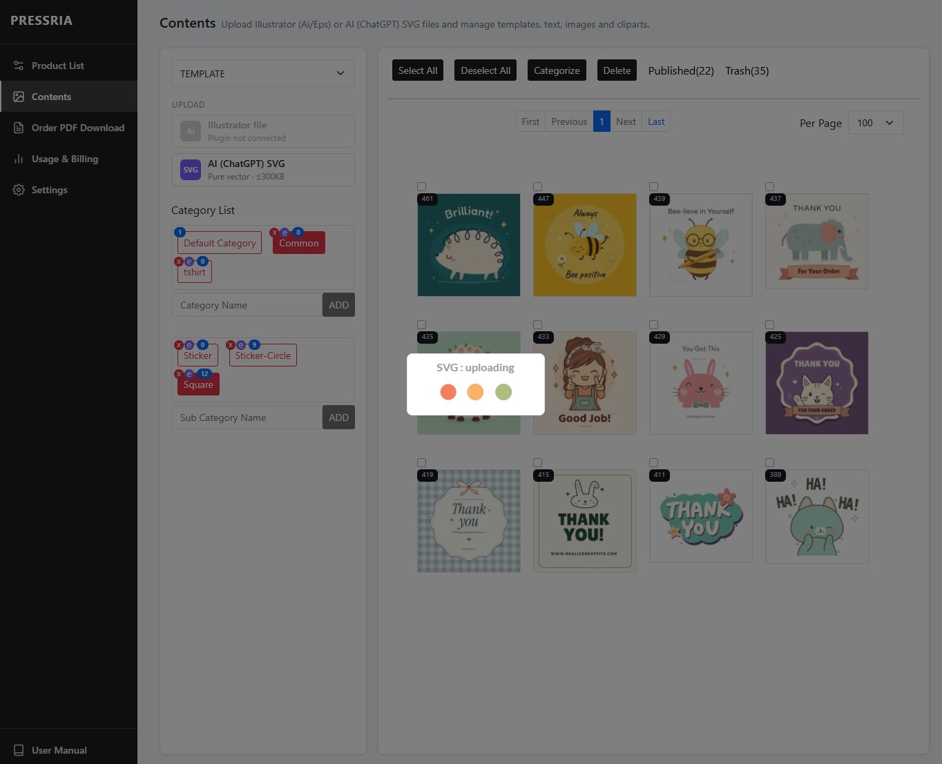
Wait while it reads SVG : waiting, SVG : converting and then Uploading : n %. Conversion runs on Pressria's server and usually takes seconds.
SVG template registered confirms it. If anything was changed on the way in, the same box lists it — see below.
Closing the page mid-conversion does not lose the upload. The next time you open Contents, Pressria finishes registering it and tells you so.
An upload in progress into Square. The Illustrator file button is greyed out because the plugin is not running — the AI (ChatGPT) SVG button works regardless.
What the file must be
Rule
If it is broken
An .svg file of 300 KB or less
Refused. ChatGPT's vector files are usually well under 100 KB; a larger one almost always has something else inside.
No images inside
Refused — The SVG contains an image. Upload the design through Illustrator.
Fonts from Google Fonts
Refused — A font used in the SVG could not be found, or Some text could not be rendered. Ask ChatGPT to switch to a Google Font.
Each text on a single line
Refused — Only single-line, horizontal text is supported. Ask for separate text elements, one per line.
No scripts, no links to outside files
Refused. ChatGPT does not normally produce either.
Changes Pressria may report
Curved text was converted to a shape. Text set along an arc keeps its exact look but becomes artwork, so the customer cannot retype it. If the wording must be editable, ask ChatGPT for straight text.
Width/height not in mm. The size was read another way — check the template against the product before publishing.
Part of the artwork will be printed as an image. An effect that has no vector equivalent was flattened for the print file. Look at that area in the print PDF of a test order.
A group has many paths. It will load, but slowly in the customer's editor. Ask ChatGPT for simpler artwork if it matters.
As with any template: upload into Default Category or a test category first, open it in the editor, and move it into a live category once you are happy (5.1).
06Orders
Getting the print file out.
6.1Download a print-ready PDF
Order PDF Download lists orders that produced a design. Filter by a preset range — 3 Days through 6 Months — or set your own date range, or search by Order No.
Each row carries three icons:
PDF — the print-ready file for that order. This is the one you send to your printer. A product with multiple sides comes as one file with one page per side, in the order the sides were set up (3.6).
Image — the customer's original uploaded image, at full resolution. Keyring orders only. Reach for it when the print file needs reworking by hand.
Trash — removes the order record from this list.
For a sticker, the PDF carries the cut lines as separate spot-colour paths on top of the artwork — one for die cuts and, on kiss-cut products, one for the kiss cut — named with the values in Settings → Sticker (7.4). Most cutting software picks them up by those names.
Download the print file before deleting a row.
07Settings
Store-wide defaults. These apply to every product, unlike Setting Product, which is per product.
7.1Basic
Your quota counters and the editor logo. Nothing here is a setting except the last one — the rest is what you are using.
Storage Usage — total across templates, images and clipart. Image thumbnails count toward it.
User Image Usage — images your customers uploaded. Each must be under 10MB.
Illustrator Content Usage — conversions run through the plugin, broken down by template, text, image and clipart.
PDF Generation — print files produced this month.
Shop Editor Logo — the logo shown in the customer's editor. 260px × 55px PNG recommended.
7.2Keychain
Store-wide defaults for every acrylic product. Set these once, from what your acrylic printer asks for, and every keychain, stand and korotto inherits them.
Keychain Settings — Cut Line Width in mm, Cut Line Color as CMYK, and White Layer with a spread value.
Keychain Size — the base sizes offered to customers, as Base Size plus a description. Defaults run 40mm to 180mm.
Set Cut Line Color and White Layer to whatever your acrylic printer asks for. The value beside White Layer is the spread — how far the white backing extends past the artwork edge.
7.3Stand
Applies to products set to Stand in 3.2 — the acrylic piece plus the separate base it slots into. There is no Stand tab: these two panels sit at the bottom of the Keychain tab, below the settings in 7.2. They are split out here because they belong to a different product.
A stand ships as two acrylic pieces: the printed piece, and a base it stands in. The printed piece gets a tab added below its outline; the base gets a matching slot. These two panels decide the dimensions of both.
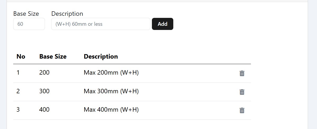
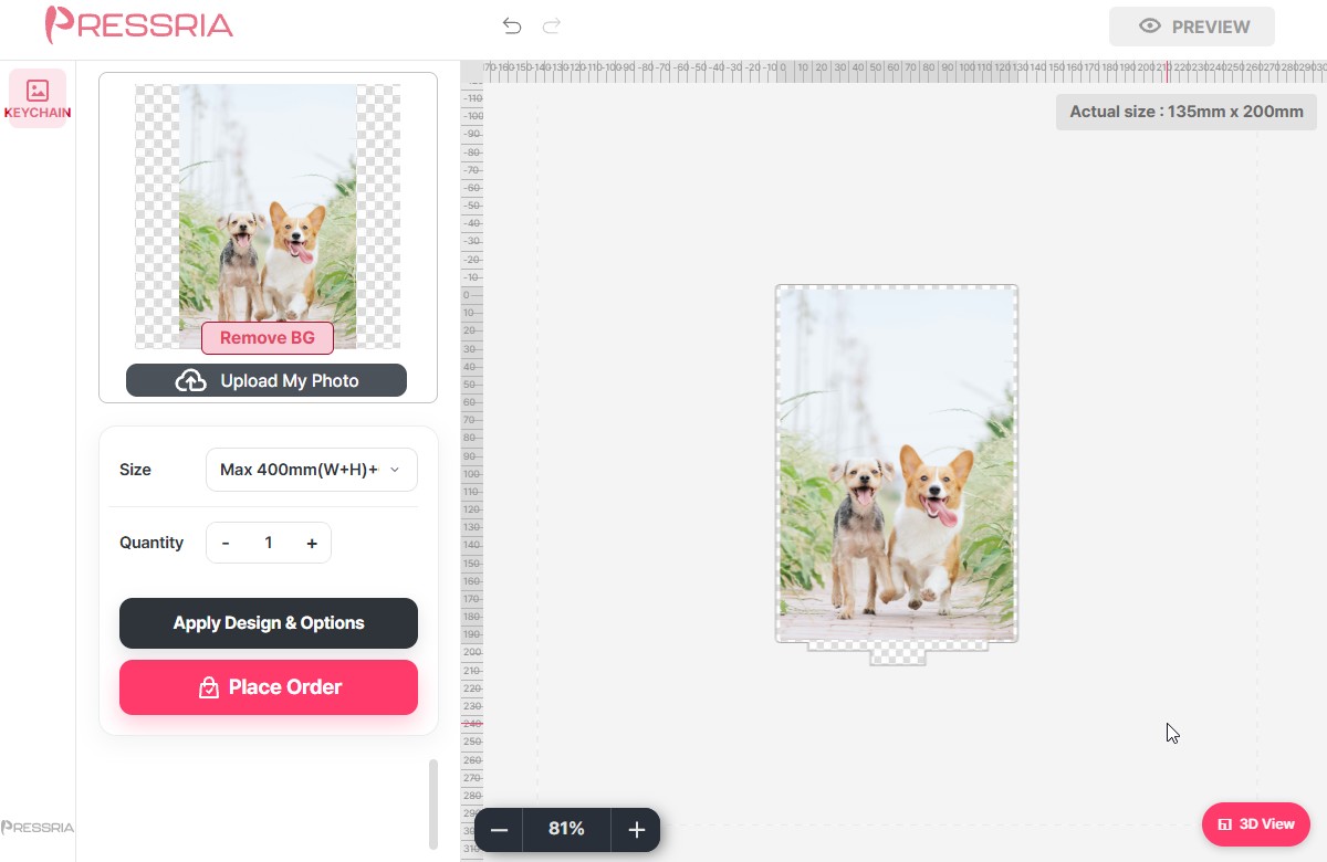
Stand Size — the sizes offered to customers, as a Base Size value plus a description. The number is a limit on width + height of the design, not on either side alone, which is why the defaults read Max 200mm (W+H), Max 300mm (W+H) and Max 400mm (W+H). A 150 × 50 design and a 100 × 100 design both fall under 200. These are the entries the customer sees in the editor's Size dropdown, so write descriptions they can read.
Stand Size — the size options customers pick from. The description text is what they read.
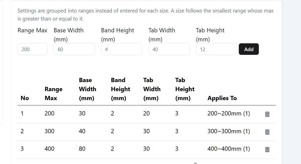
Stand Base — the four measurements, entered per range rather than per size. A size follows the smallest range whose Range Max is greater than or equal to it, so one row covers everything up to that number.
Field
What it measures
Base Width
How wide the base piece is.
Band Height
Clear acrylic added below the artwork on the printed piece. The cut line drops by this much past the bottom of the image, leaving a blank band that meets the base.
Tab Width
How wide the tab under that band is.
Tab Height
How far the tab extends below the band.
The default first row reads: up to Range Max 200, a base 30 mm wide, 2 mm of clear acrylic under the image, and a tab 20 mm wide by 3 mm deep. Larger ranges get a wider base — 40 at 300, 80 at 400 — because a bigger print needs more foot to stay upright.
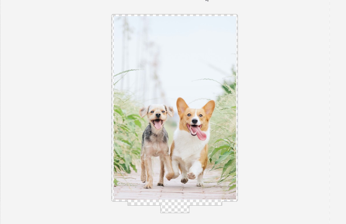
Note what Band Height does to the outline: the printed piece is cut taller than the image. A design that runs to the very bottom edge will still have a strip of clear acrylic under it. That is deliberate — it is what the base grips — but it is worth knowing before a customer asks why their print does not reach the bottom.
Stand Base — one row per range, with the sizes it covers in Applies To.
The customer's side. Size lists what you entered in Stand Size; the outline continues past the image by Band Height, with the tab below it.The same edge, close up — the clear band, the tab, and the base it seats in.
Both pieces are cut from the same sheet and come apart in the box; the customer pushes the tab into the base.
7.4Sticker
Three cards. The first two follow the same idea as the keychain settings — your print shop names the values, you enter them once here. The third is where you make sticker types of your own.
1. Sticker Cut Line — CMYK and spot-colour name for Die Cut (CutContour) and Kiss Cut (PerfCutContour). Set these to whatever your print shop's cutter expects; every sticker PDF uses them (6.1).
2. Sticker Color Profile — the CMYK Profile your print shop specified. Leave it as is if you were not given one.
3. My Sticker Presets — your own sticker types, described below.
My Sticker Presets
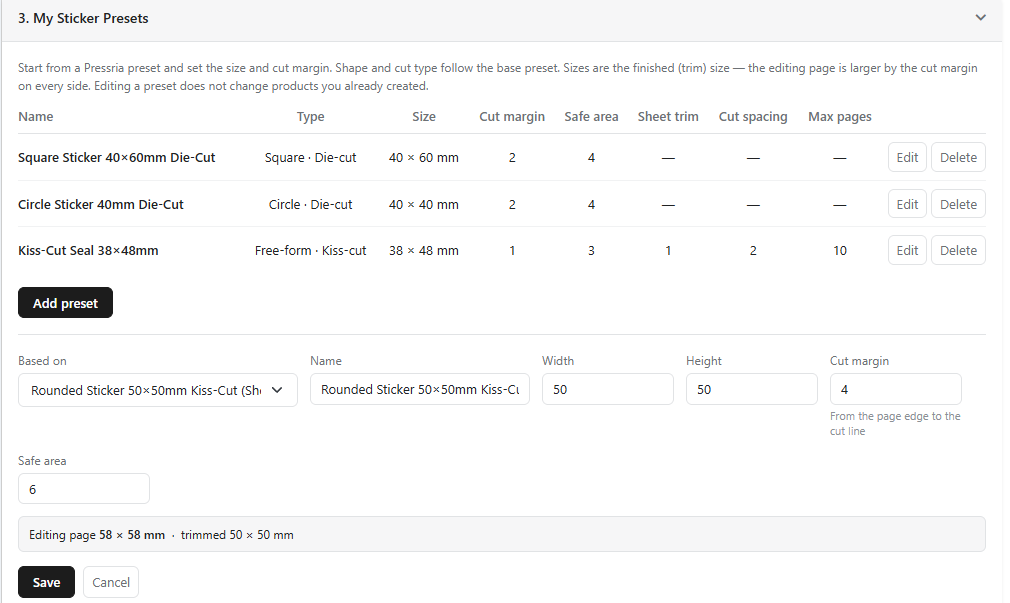
Pressria's sticker types cover the common market sizes. When you sell a size or margin that is not among them, make it here: Add preset, pick one of Pressria's types under Based on, and change what you need. Your preset then appears in the Sticker column's type list (3.8) alongside Pressria's.
The shape and the cut come from the base and cannot be changed — a preset based on a circle kiss-cut is a circle kiss-cut. That is deliberate: it rules out combinations the production side cannot cut. Pick the base that already has the shape and cut you want.
Field
What it sets
Name
What you and your staff see in the type list. Put the size and cut in it — the list shows nothing else.
Width / Height
The finished size in mm, after cutting. The editing page is larger by the margin on every side.
Cut margin shapes (3.11, 3.12)
From the page edge to the shape's cut line — the bleed around the shape.
Cut offset free-form (3.9, 3.10)
From the edge of the artwork to its traced cut line — the white border around each sticker.
Safe area
From the page edge to the inner guide. Must be larger than the cut margin — a safe area outside the cut is refused.
Sheet trim free-form (3.9, 3.10)
From the page edge to the die-cut edge of the sheet. 0 means no separate sheet trim. Kiss-cut shapes (3.12) do not show this field: they keep the sheet trim of their base, and their Cut margin must be larger than it — otherwise the sheet edge would run along or through the sticker, and the preset is refused.
Cut spacing
Free-form only. How close two stickers may come before the editor warns and blocks the order (3.9).
Max pages
Seals and kiss-cut sheets (3.10), and kiss-cut shape sets (3.12): the cap on total quantity per order.
While you type, the line under the form shows the result — for example Editing page 54 × 54 mm · trimmed 50 × 50 mm for a 50 mm square with a 2 mm cut margin. Check it before saving: the trimmed size is what the customer receives. Fields that do not apply to the base are hidden — Sheet trim and Cut spacing appear only for free-form bases. On a kiss-cut shape the trimmed size is the sticker; the backing sheet around it is slightly larger (3.12).
A preset is copied onto a product when you apply it, not linked. Editing or deleting a preset changes nothing on products already using it, and nothing on past orders. To move a product onto the edited values, Unset it in the Sticker column and choose the type again.
Start from a Pressria type, then set the size and margins. Shape and cut type follow the base.
08Usage & billing
Reading the meter, and what each channel charges.
8.1Reading the usage page
A design is recorded when a customer completes their personalization and the print file is produced — not when the order is placed. The page reads a ledger, so nothing on it is recalculated after the fact.
Four cards summarize the current cycle:
This cycle designs — designs recorded so far.
Free quota — your first 20 designs, with how many are left. On a paid plan there is no allowance, so this card is labelled Plan instead.
Billable designs — what will appear on your next invoice.
Estimated charge — your plan's monthly fee plus the usage actually recorded this cycle. It is an estimate only because the cycle is still open; refunds and adjustments can still move it.
Below them, one row per billing cycle. Designs and Items normally match; they diverge when a customer orders more than one copy of the same design — three keyrings from one photo is one design and three items. Refunded and Adjustments stay empty unless something was corrected.
A Billing sync note at the bottom tells you how much of the next invoice has already been submitted to the payment provider. Once an amount is submitted it will be charged even if usage changes afterwards.
8.2Plans
Four plans: Free, Studio, Scale and Pro — the same tiers at the same prices on both channels. Each carries a monthly fee, a per-design rate, and a usage billing cap you approve up front. The monthly fee is billed separately from the cap.
Plan
Monthly
Rate per design
Usage cap
Free
$0
5% (min $0.05, max $5.00)
$100
Studio
$39
3% (min $0.03, max $5.00)
$250
Scale
$129
1.8% (min $0.02, max $5.00)
$800
Pro
$349
1.1% (min $0.02, max $5.00)
$5,000
All paid plans include a 14-day free trial. The Free plan's 20-design allowance resets every cycle; paid plans have no allowance and charge every design at the lower rate shown above. Invoices are issued monthly in USD.
Stickers use a lower minimum. Die-cut sticker designs are charged the same percentage but with a smaller floor — $0.03 on Free, $0.02 on Studio, $0.01 on Scale and Pro. The table above quotes the higher, general minimum, so a sticker is never charged more than it shows.
Only the mechanics around the plans differ by channel:
Shopify
WooCommerce
Changing plan
Goes to Shopify's approval screen. Subscriptions cannot be edited, so a new plan creates a new subscription and replaces the old one on approval.
Connect a payment method first — the plan buttons stay hidden until billing is connected.
Billing cycle
Calendar month.
Runs from your sign-up date. A store that signed up on the 9th bills the 9th to the 8th, in UTC.
In both cases nothing changes until you approve it, and rates are never applied retroactively — designs already recorded keep the rate in effect when they were created. Cancelling applies at the end of the current period.
09Troubleshooting
What merchants actually get stuck on, and what to check first.
9.1The personalization screen doesn't appear after checkout Shopify only
Open the app. If the Finish setup banner is still there, it names the step that is missing (2.2). If it is gone, check Settings → Checkout → Post-purchase page directly and confirm it still says Pressria — Shopify allows only one app in that slot, so a post-purchase app installed later will have taken it over without warning.
9.2“The domain name you're trying to access is different from the domain name registered to Illustrator”
This alert in Contents means the plugin is running and the admin can see it — but Illustrator is authenticated to a different store than the admin you have open. The two have to name the same domain.
In Illustrator, open the Pressria panel and click Change Domain. Enter the domain for the store you are actually uploading to, as a full address with https://, and confirm. Then retry the upload.
Three things cause the mismatch, in the order worth checking:
The https:// prefix. The match is literal against the domain stored for your shop, and that value may or may not include the protocol. If https://www.abc.com is refused, try www.abc.com, and the other way round. This is the most common cause and the least obvious.
Shopify custom domains. The plugin wants the .myshopify.com address; typing the customer-facing domain points the plugin at the wrong one (4.3).
More than one store. Illustrator holds one domain at a time, so it is still pointed at whichever shop you uploaded to last.
9.3The Edit Design button is missing on a product page WooCommerce only
On WooCommerce the editor is reached from an Edit Design button beside Add to Cart. Two things stop it appearing:
The product is not set up. Check the Pressria column in your WordPress Products list, or Product List in the product manager — the Pressria button on its row should be solid blue, not outlined (see 3.1).
The cache is stale. Your shop caches which products are editable, so a product you set up minutes ago may not show the button yet. Go to Pressria Settings in WordPress and click Refresh Product Status, under the Edit button not showing? card.
9.4An order never reached Pressria WooCommerce only
Order handoff retries in the background rather than failing outright, and every attempt is written to the order as a note. Open the order in WooCommerce and read its notes before reporting anything — a transmission that failed once and succeeded on retry looks identical to a healthy order except there.